Florana
Designing a centralized e-commerce website to make it easier for customers to to browse, customize, and order flower arrangements and to provide flexible scheduling for workshops.
Responsive Design
Role
Product & UX/UI Designer
Duration
Q3 2023

Context
Florana is a small business based in Monterrey, Mexico. It likes to accompany its customers in their history, in their most special events, that is why the company is dedicated to make floral arrangements and / or balloon structures that reflect the personality of the person who receives them. It also offers theme workshops. Florana's values are creativity, inclusivity, love, and honesty. It offers its products through Instagram and Facebook which does not help in providing options for the customers to choose from.
Note: Through the end of the project, the business owner consider in switching to event flower arrangements only. Thus, the website wasn't created future work will focus on this new direction.
The challenge
Florana's current system hinders both flower buyers and workshop attendees. Flower buyers struggle to find the perfect arrangement due to time-consuming browsing, limited product information, and inflexible customization options. Workshop attendees have limited scheduling options, restricting participation for busy lifestyles. This reduces sales, engagement, and ultimately, Floriana's impact.
The solution
A centralized e-commerce website which allows flower arrangement browsing, customization, and ordering, while offering a flexible workshop scheduling system. This improves the customer experience and boosts engagement.

Expert guidance
Stay up-to-date with the latest updates on your favorite webtoons. The convenient notification bell on the homescreen ensures you never miss an important announcement. View all notifications from your webtoon status (on hiatus/returns) and app changes in one central location.
Workshop inquiry
Stay up-to-date with the latest updates on your favorite webtoons. The convenient notification bell on the homescreen ensures you never miss an important announcement. View all notifications from your webtoon status (on hiatus/returns) and app changes in one central location.

Flower arrangement ordering
Stay up-to-date with the latest updates on your favorite webtoons. The convenient notification bell on the homescreen ensures you never miss an important announcement. View all notifications from your webtoon status (on hiatus/returns) and app changes in one central location.
Let's get into the design process
What are the competitors doing?
I performed a competitive analysis to better understand Florana's competitors in how they provide their products to their customers. The competitors were provided by Florana.
Enviaflores and Cocoita have established strong online presences with their user-friendly websites, featuring catalogs that highlight popular products. Both companies focus on providing flower arrangements for gifts, while Splendora caters to both grand events and personal gifting. Florana's absence of a website presents a significant gap in their market reach. By developing a website, Florana can emulate the successful strategies of their competitors, offering a more accessible and comprehensive platform to showcase their products and attract a wider customer base.

Enviaflores
Different categories to locate your product
Complementary item recommendation based on selection
No search bar
No shopping cart/bag displayed

Cocoita
Search bar
Catalog section which shows discounted and non-discounted products
No filter option
Only shows 2 testimonials
Splendora Eventos
Clear and structured highlights which strongly reflect their product categories
Brand alignment even if it is an instagram page
No search bar
Looks like the products are just for big events
What do users think and expect?
Get an overview of people's thoughts
Through a user survey, I dug into what Florana's customers liked (and disliked!) about her Facebook and Instagram presence. This helped us see if a website could be a better fit, and uncover any hidden frustrations or needs they might have. The survey was answered by 28 participants.
47%
of participants preferred for Florana to have its own website
37%
of participants preferred Florana's social networks
of participants had no preference (website or social networks)
57%
of participants have used a competitor's website to make purchases
of participants expressed a desire for an online catalog that's up-to-date and organized by categories
Dive deeper into their needs
To understand Florana's customers better, I jumped on video calls with 5 amazing people in Mexico, aged 25-65. We chatted about their experiences with Florana and similar businesses. I used a handy interview guide to keep things focused, and Airgram for Spanish transcriptions.
"What I don't like about Instagram is that everything goes down, and when I want to search for something, it takes me a long time to find it"
"I don't know much about flowers, and I appreciate it when they offer me options"
"I didn't know about the workshop until I saw an Instagram story, and the photo wasn't very eye-catching"
Connect the dots
After gathering the participants' experiences, needs, and pain points from our conversations, I synthesized the data using affinity mapping to uncover common themes from the interviews. This method allowed me to identify key user insights.
The emotional and practical
Florana's customers aren't just buying flowers, they're sending emotions. Striking arrangements are key, but so is practicality. Users crave reliable delivery, flexible payment options, and budget-friendly choices.
Crystal clear catalog, confident decisions
Users prioritize a well-organized catalog with high-quality images, detailed descriptions, and clear pricing. This empowers them to make quick, informed choices with confidence.
The Power of choice
Some users love browsing ready-to-go arrangements, while others crave a more personal touch.
Workshops made easy
Users want clear workshop information and scheduling details readily available, not hidden in Instagram stories. Flexible timing options cater to busy lifestyles and maximize workshop participation.


HMW create a seamless and delightful floral experience that caters to diverse needs, simplifies purchasing, and empowers customization?
From user needs to must-haves
Drawing on the user research insights, I created a comprehensive feature set. Through collaborative discussions with the client, we prioritized functionalities based on their importance and impact. This process resulted in a clear distinction between "must-have" features critical to the core user experience and "nice-to-have" features that could be considered for future iterations.
Must-have
Account Creation
Landing Page
Search bar
Search results page
Filter
Catalog categories
Product information for flower arrangements
Product information for workshops
Customization options for flower arrangements
Flexible Workshop Scheduling
Expert Support in Arrangement Selection/Order
Nice-to-have
Product recommendation based on selection
Flower symbolism
Order status
Testimonies
Rate & Reviews
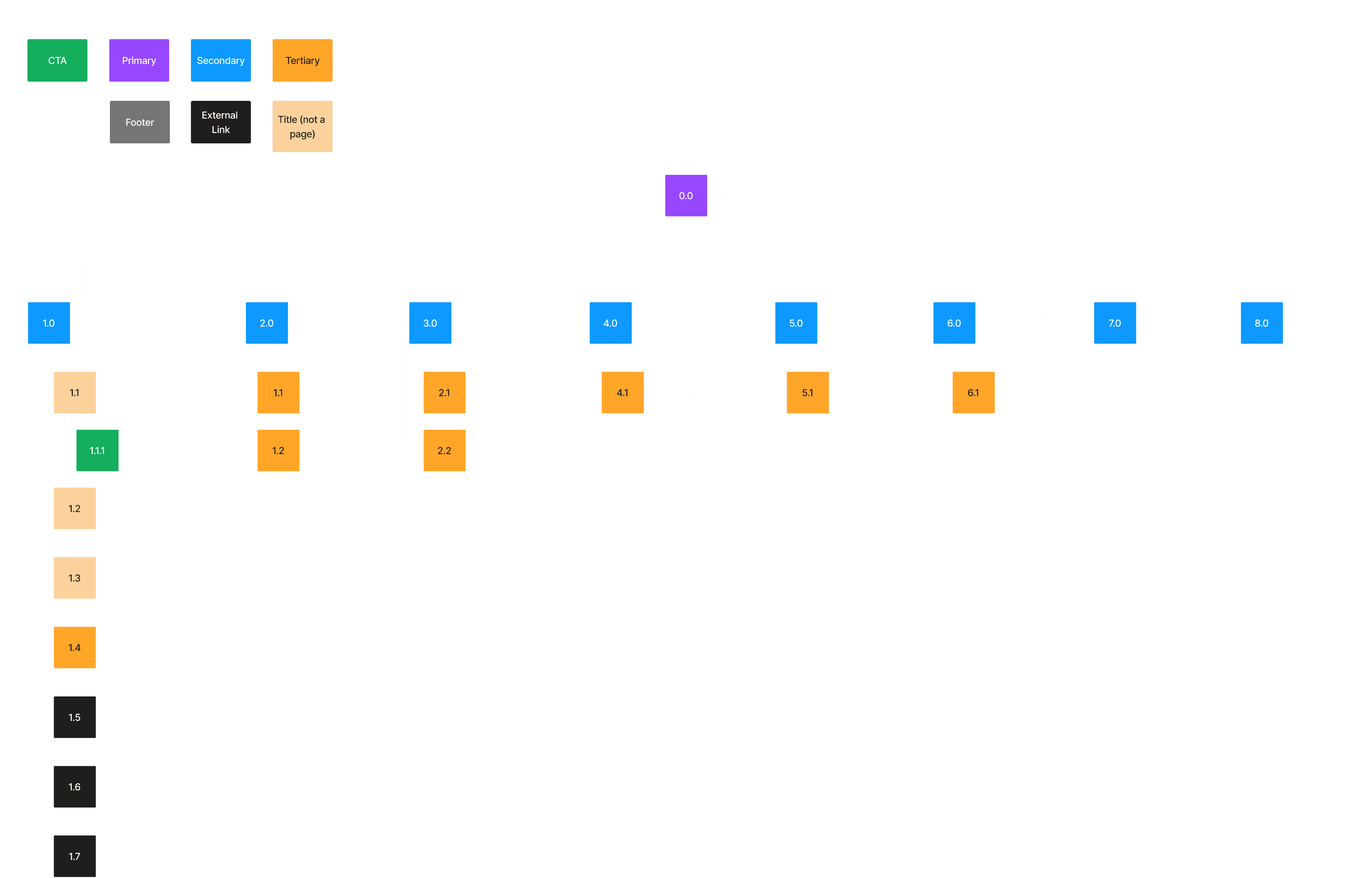
Defining the website structure
Having identified the key features to prioritize, I developed a sitemap to provide a clearer visual representation of the website's structure.
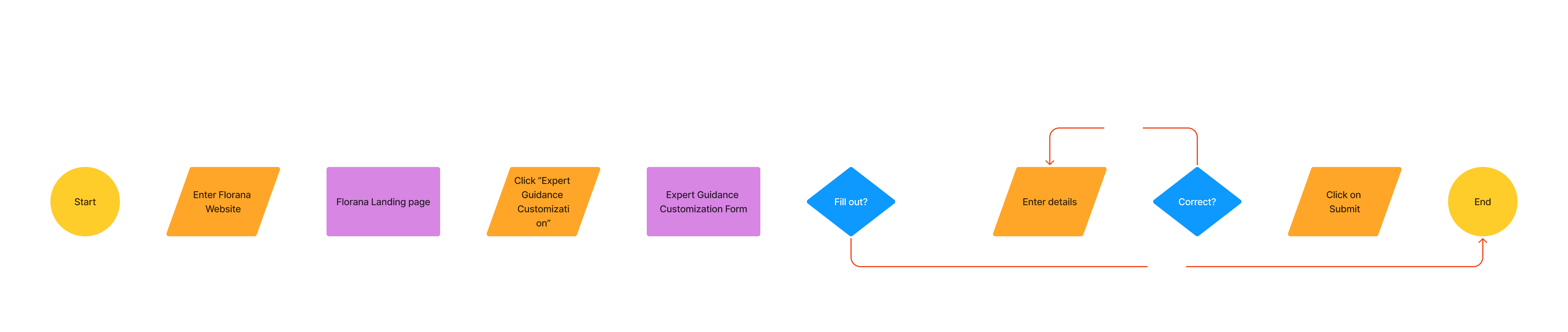
Mapping the user journey
After defining the features and their structure, I also established userflows to help both Florana and its users efficiently achieve their objectives.


Defining the brand voice and visual language
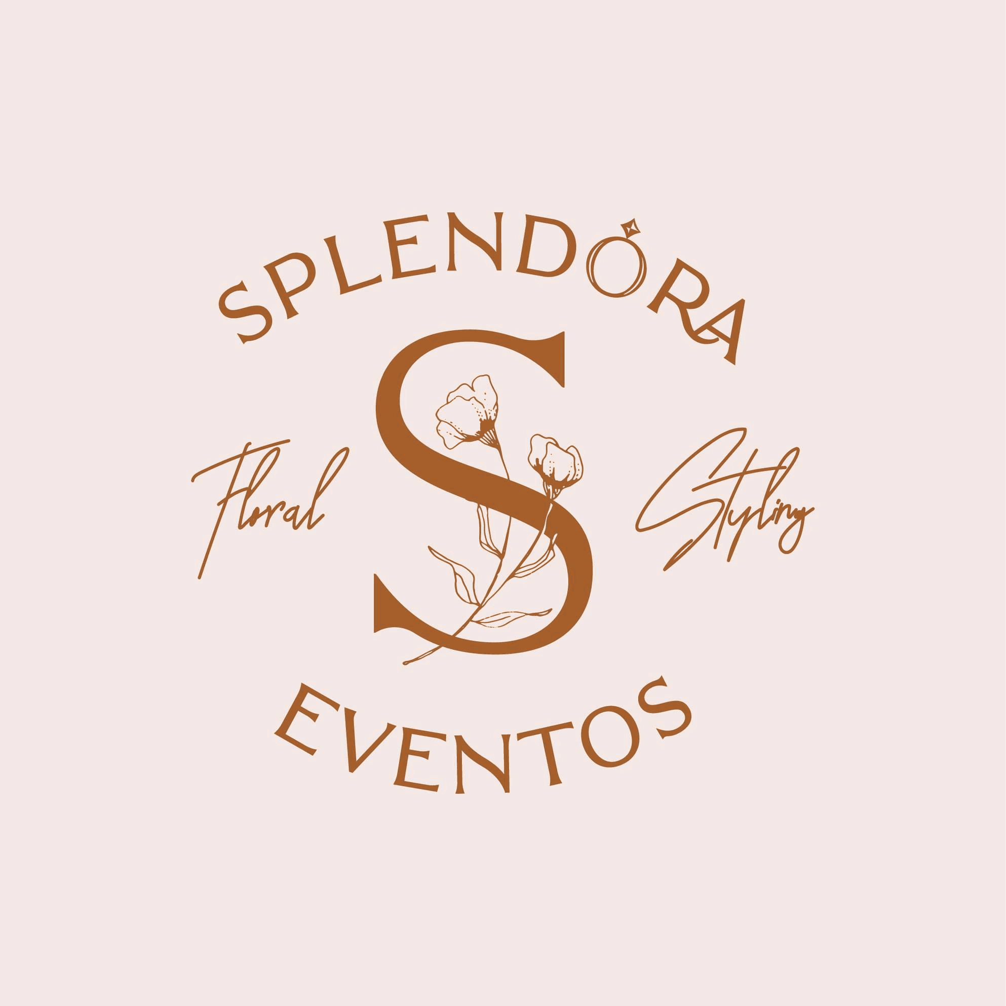
Florana's visual identity refresh
Florana's existing logo, created with pre-existing assets in Canva, didn't fully reflect her unique brand identity. To establish a stronger visual foundation, we decided to embark on a logo redesign before diving into the website sketches.
Previous logo on instagram

New logo
For website
Unveiling Florana's essence
To capture the heart of Florana's business, I collaborated with the client to uncover their existing brand values. Through open discussions, we refined and solidified these values, ensuring they accurately reflect the brand's philosophy. With a clear understanding of the brand's DNA, I then crafted a cohesive brand style tile.
Brand's values

Embracing innovation
Constantly pushing the boundaries of floral design, crafting unique arrangements that surprise and delight.

Celebrate everyone
Flowers are a universal language of love and appreciation. Our arrangements are designed to make anyone feel special.

Honesty is the best policy
Clear communication and fair pricing. What you see is what you get – no hidden fees or surprises.
Brand style tile

Transforming ideas into solutions
Designing the features
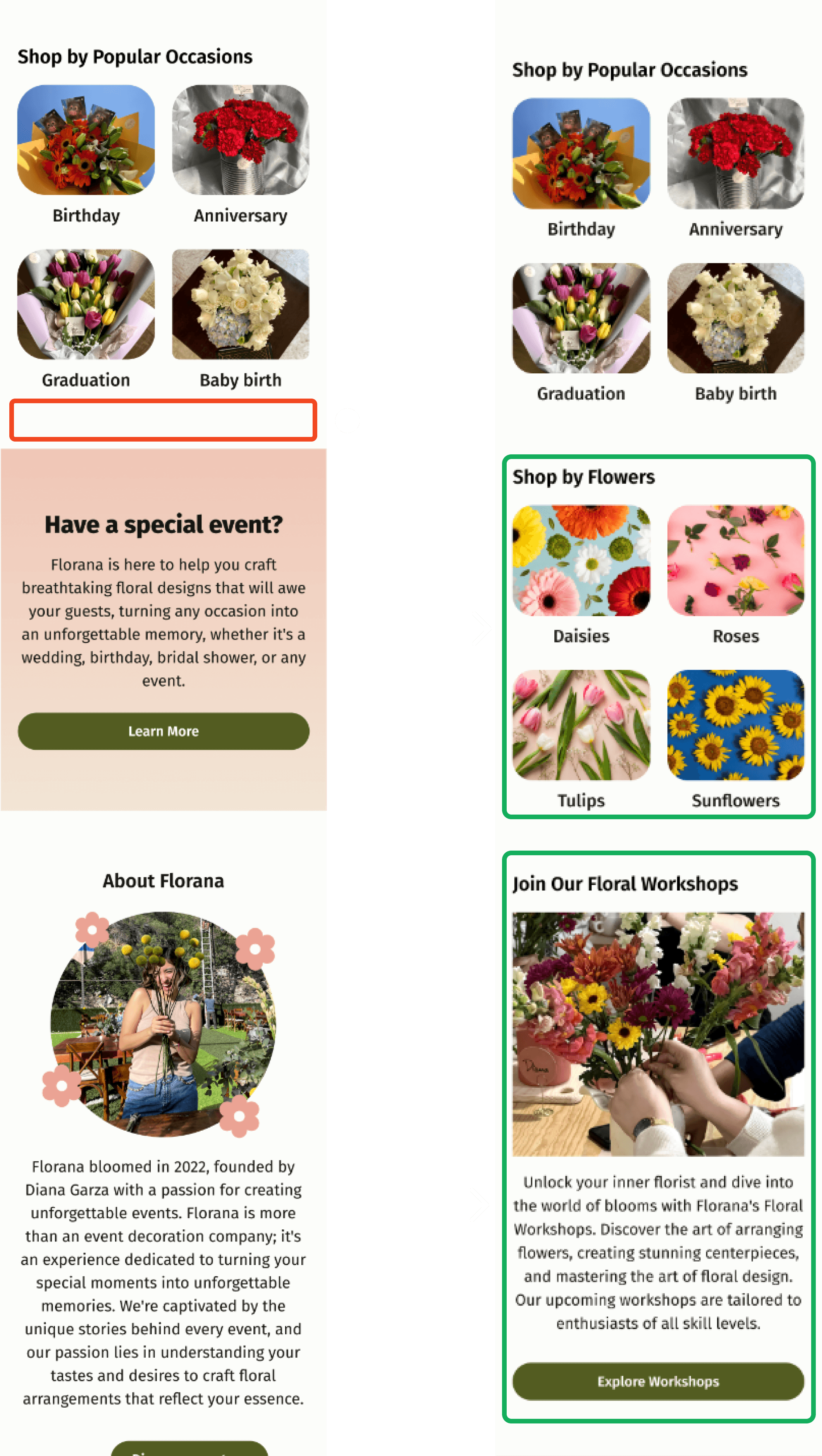
Building upon the identified user needs and prioritized features, I designed low-fidelity wireframes. These wireframes served as the blueprint for the Minimum Viable Product (MVP), focusing on the essential functionalities and user interactions.
Expert guidance customization

Workshop interest inquiry form
This user flow enables users to seamlessly transfer their subscribed series from one list to another. This feature provides flexibility and allows users to reorganize their webtoon collections based on their evolving preferences, ensuring a personalized and efficient reading experience.

Selecting flower arrangement

Enhancing clarity through mid-fidelity wireframing
To give the client a clearer picture of the website's structure and interaction flow, I created mid-fidelity wireframes. These wireframes go beyond basic functionality by introducing a more defined layout and preliminary visual hierarchy. While final color palettes and fonts are reserved for the high-fidelity stage, the mid-fi wireframes establish the foundation. The wireframes were created for both mobile and desktop.


Crafting the UI component library
With the brand style tile established and mid-fidelity wireframes in hand, it was time to develop a UI Component Library. This library serves as the foundation for Florana's digital presence, ensuring consistent brand identity across all user interfaces.
For Florana, the brand essence aimed to evoke a feeling of freshness and delicate beauty. Eucalyptus emerged as a natural symbol that embodied these values. This theme subtly influenced the selection of the CTA color.

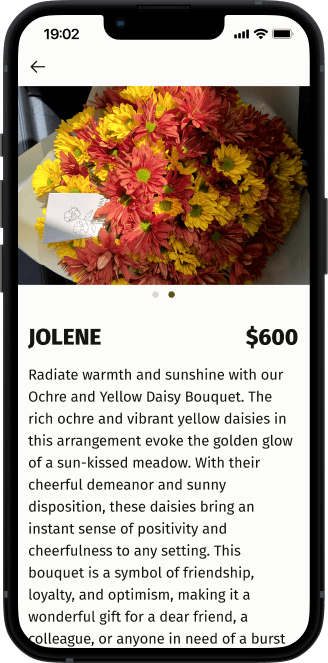
Bringing the design to life
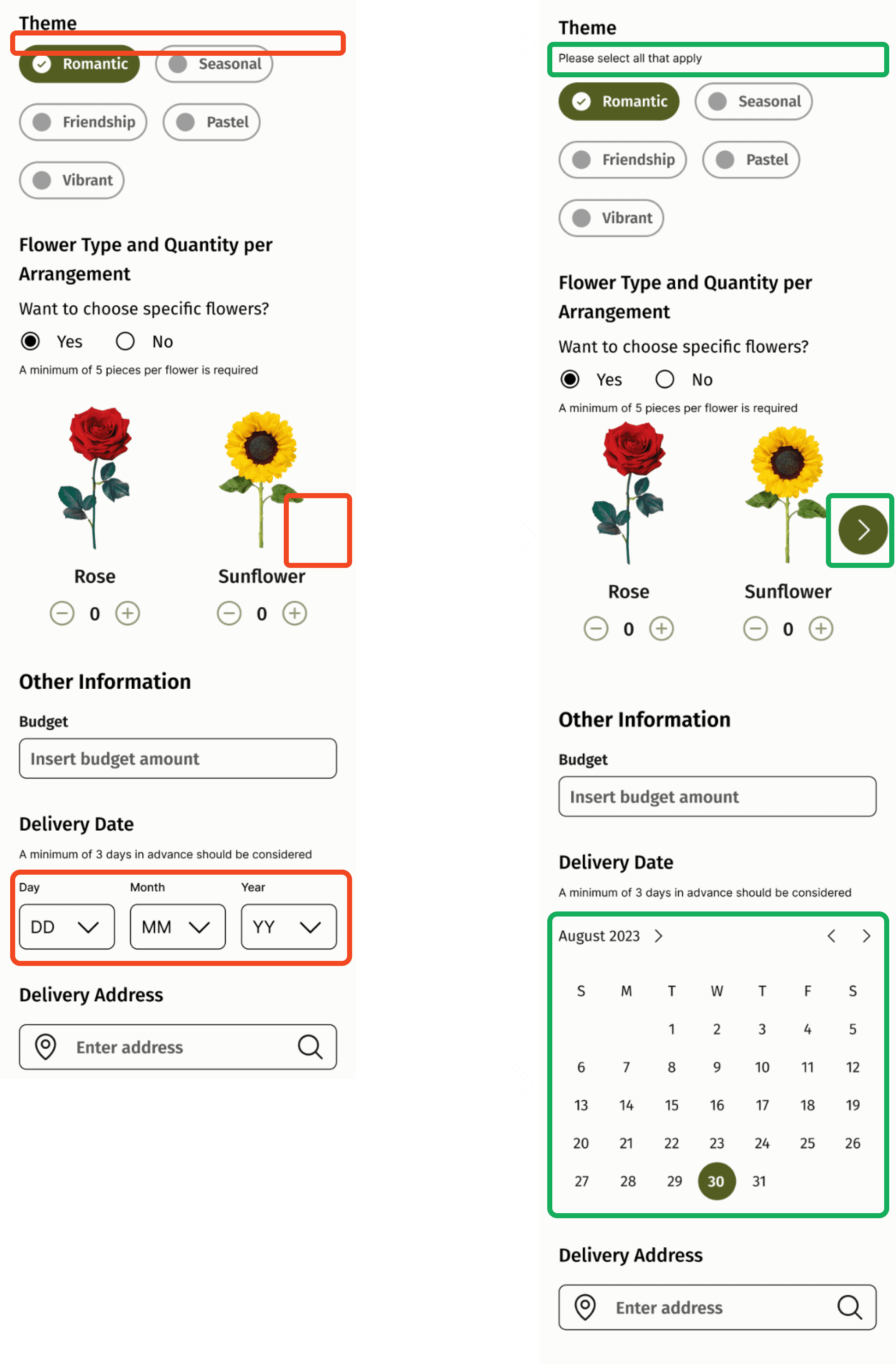
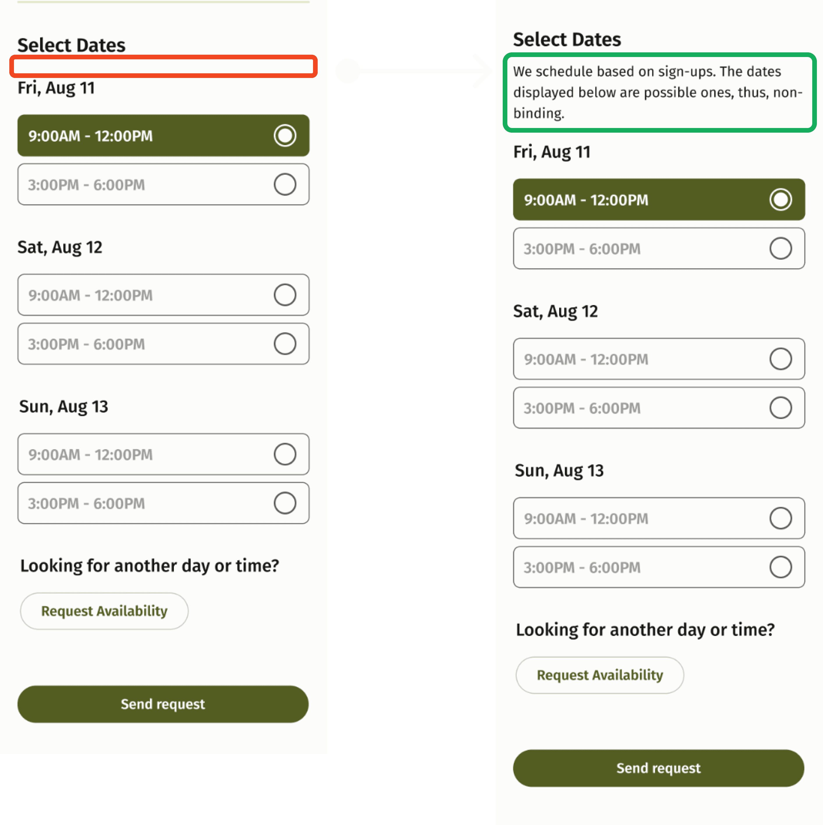
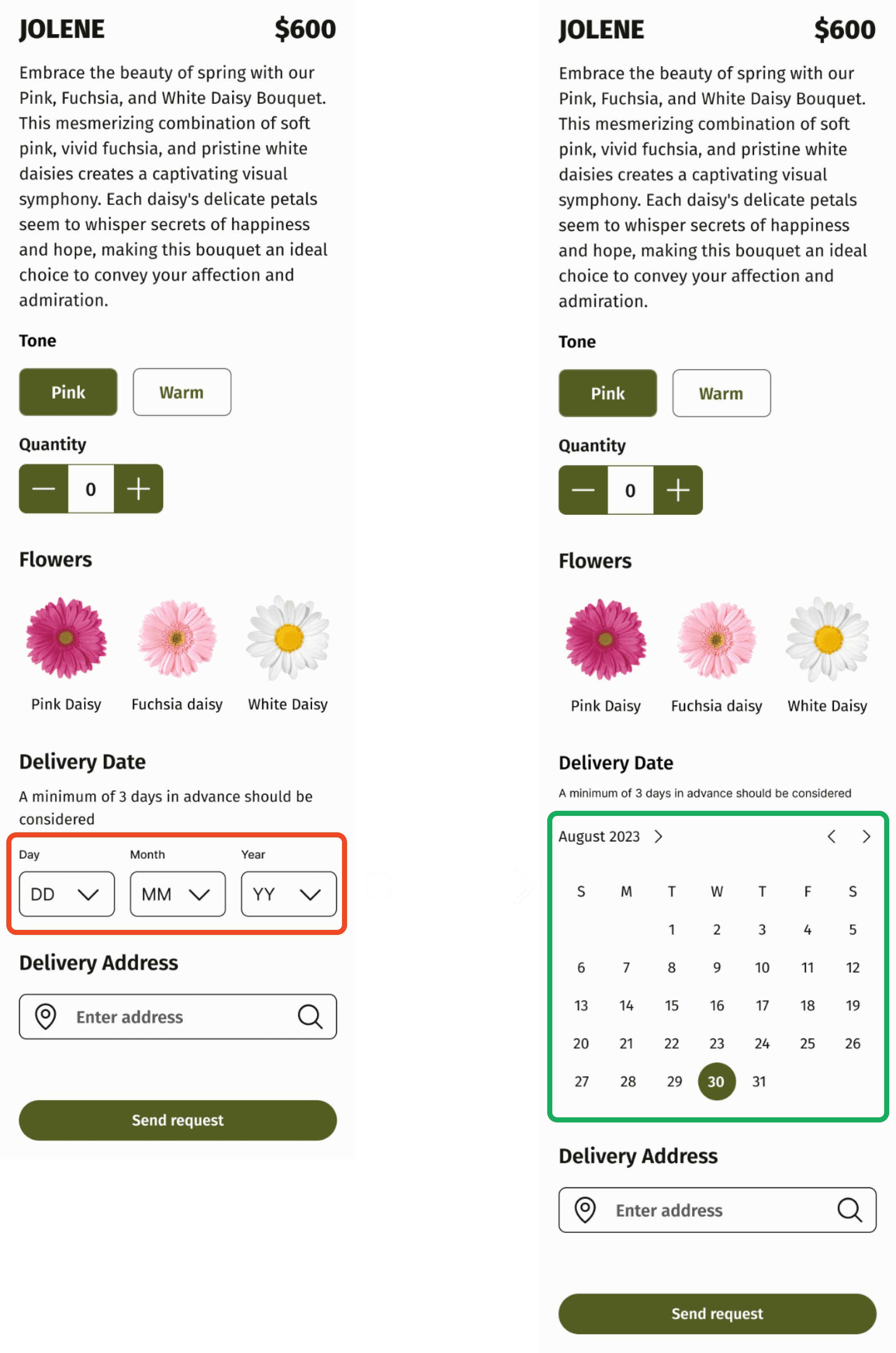
With the brand identity established, I then started to design the high-fidelity (hi-fi) wireframes. These hi-fi versions represent the final visual design, incorporating color palettes, typography, and high-quality imagery. This level of detail allows me to present a polished and realistic representation of the website to the client. Through internal reviews and discussions with the client, we can ensure the design aligns with Florana's vision and objectives before proceeding to user testing.
Homescreen

Expert Guidance Form
Flower arrangement
Workshop interest

Let's test it
Testing the prototype
To gather user feedback on the design, I conducted an unmoderated usability test, using the tool Lyssna, with six participants.
Tasks
Send a request for Expert Guidance on a Flower Arrangement.
"Pre-book" a Workshop.
Request a pre-defined Flower arrangement.
Results

While most participants provided favorable ratings for the tasks, a primary concern emerged regarding the desire to perform all tasks directly from the home screen, rather than having to navigate to the menu screen each time. The feedback was ordered according to the frequency and severity mapping; however, given the limited amount of feedback received, I have decided that, for the next iteration, I will address all feedback, regardless of its severity or frequency.
Refining for a better experience
Feedback improves functionality
I made changes aimed at enhancing the test's usability, ensuring that users can complete the task quickly and with minimal clicks.
The prototype
Here is the hi-fi prototype after integrating the user feedback
What did I learn?
Remote collaboration
Working with a client in a different time zone (Mexico to Germany) presented challenges. Translating user interviews from Spanish and coordinating schedules were hurdles. We addressed this by mutually agreeing on English as the project language (for case study purposes). This emphasizes the importance of adapting communication strategies for remote collaborations.
Prioritization and time management
The project demanded building a responsive website with limited time. This meant prioritizing features and breaking the design process into manageable steps. This highlights the importance of having the ability to adapt to time constraints and make strategic design decisions.
Getting early user feedback
The project reinforced the importance of early user feedback throughout the design process. It's a continuous loop, not a linear path. Early feedback allows for course correction and ensures the final product aligns with user needs.
Collaborative design
This project echoed the power of design as a team sport. From user interviews to client meetings, collaboration fosters a thrilling and fulfilling experience, ultimately leading to a solution that bridges user needs and client vision.
Next steps
Centralized organization
Working with a client in a different time zone (Mexico to Germany) presented challenges. Translating user interviews from Spanish and coordinating schedules were hurdles. We addressed this by mutually agreeing on English as the project language (for case study purposes). This emphasizes the importance of adapting communication strategies for remote collaborations.


Let's connect!
Come say hi! And let's create something awesome together
2024 Claudia De León