The challenge
Navigating the labyrinth of information required to move to a new country is a daunting and often overwhelming task for prospective immigrants. The current process is a significant barrier, filled with complexity and confusion.*
The solution
An app that assists immigrants throughout their immigration process by providing personalized checklists, matching them with mentors, and facilitating video call sessions for guidance.
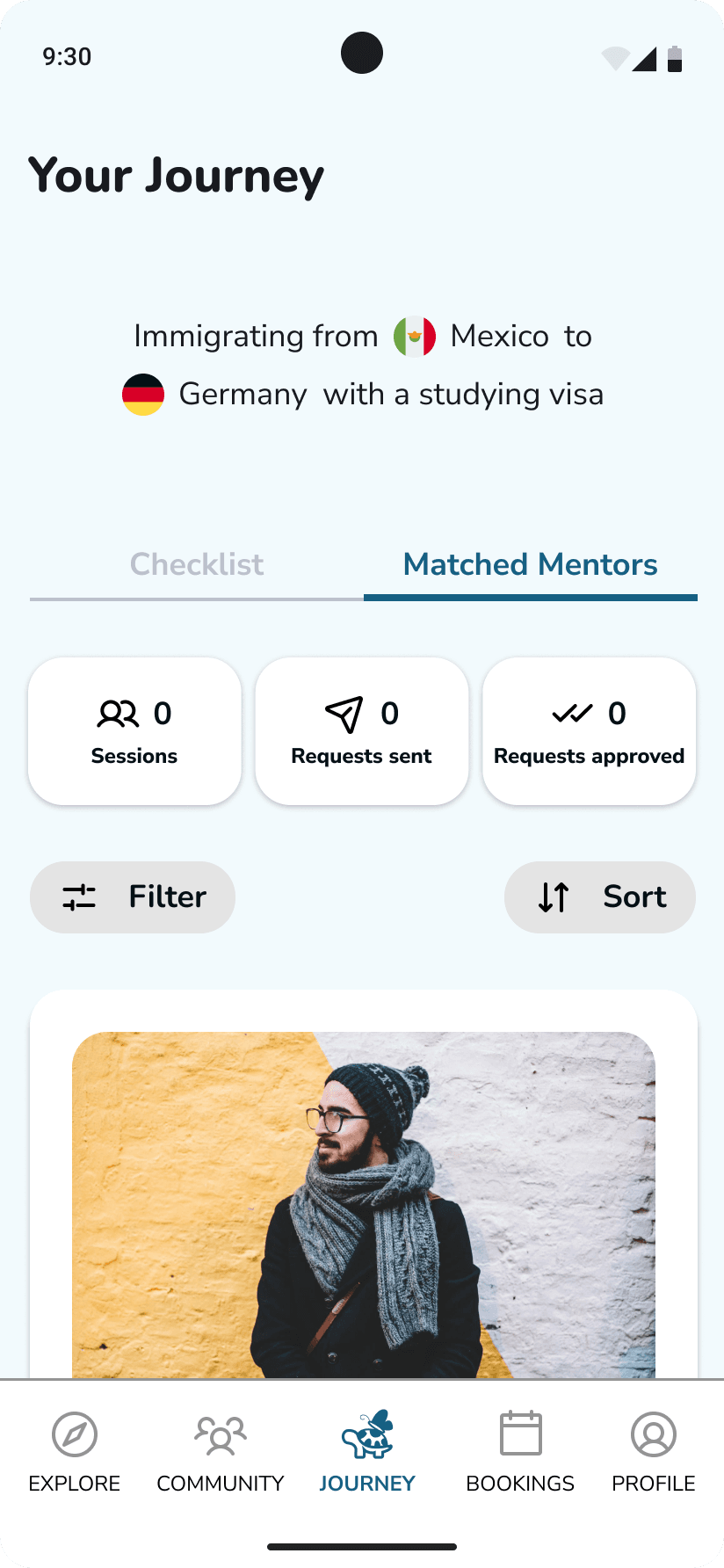
Keep track of your journey
Personalized immigration checklist based on your information and plans.
Matched mentors
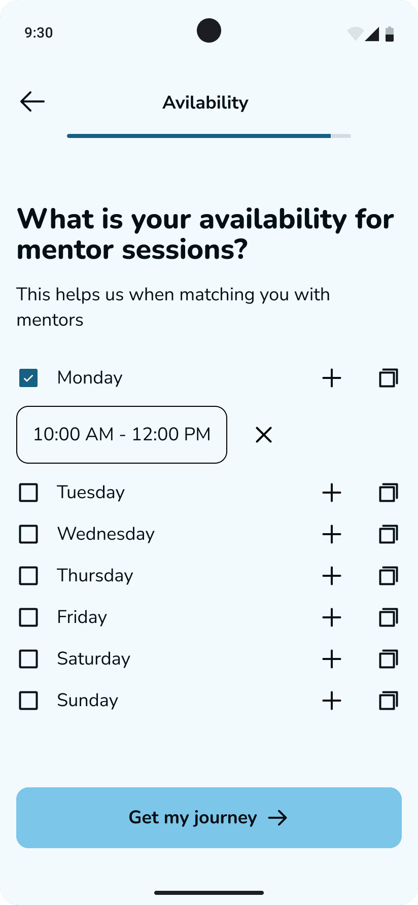
Mentor recommendations based on your situation and availability.
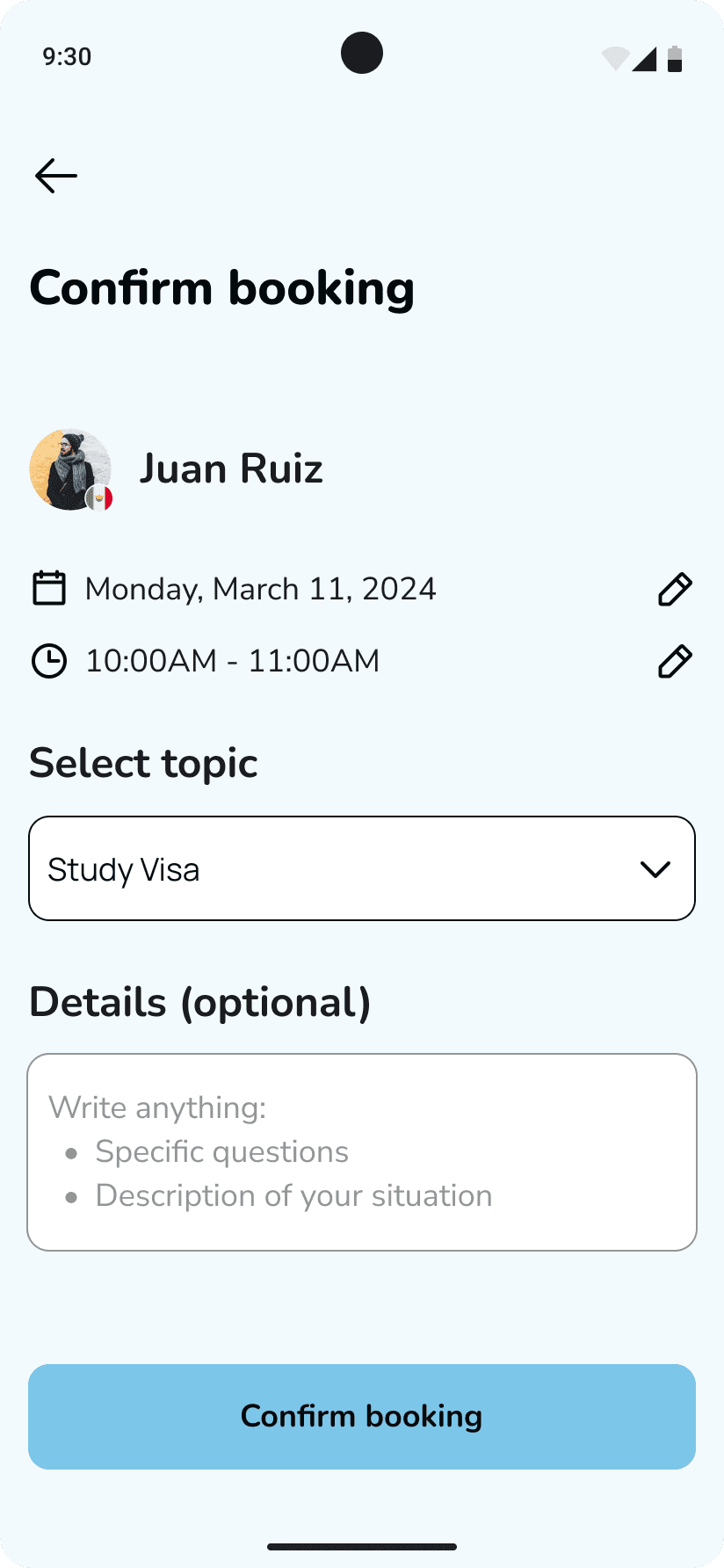
Mentor sessions
Videocall with mentors who can answer your questions and help you on your journey.
*Not all screens are shown
Let's get into the design process
Assumptions
Immigrants face difficulties navigating the complex process of moving to a new country due to:
Information Overload
Lack of Guidance
Scattered Resources
Getting to know immigrant's experience
User Survey
Gain a quick snapshot of the experiences of future immigrants throughout their immigration journey, particularly their current stage, their thoughts and frustrations, the information they find most valuable, and the tools they use.
User interviews
Hearing immigrants stories and unveiling their needs.
Understand their painpoints when seeking information about moving to a new country.
Learn the most critical information needs and priorities when considering immigrating.
Understand how they plan for their immigration
Survey insights
82%
of participants use google when planning their immigration
45%
of participants seek information from friends or family who have immigrated
72%
of participants use government or official websites when planning their immigration
72%
of participants are considering and researching
6 out of 9*
participants said they felt confused and lost with all the information
2 out of 9*
participants said they felt the information could not be trusted
*11 people answered the survey, but this was based on an open answer
User interview insights
Information Overload
Unclear instructions and unexpected requirements make it difficult for immigrants to know if they have everything they need, leading to frustration and stress.
Checklists are not enough
Immigrants need clear instructions, visibility into each step, and an understanding of what to expect. A simple checklist isn't enough. They need to know what to do, how to do it, and where they are in the process.
What to trust
Reliable information is crucial, but official sources often leave them wanting. Immigrants rely heavily on word-of-mouth and established agencies, seeking guidance and support from those who've walked the path before.
We heard users…now, what's out there to help?
Direct competitors



Indirect competitors

Key Findings
Broad resources: Competitors offer more than just visa information.
Quick access: Info can be quickly accessed by destination country.
User-friendly: NICHE provides tailored info, comparisons, and reviews.
Verification issues: Competitors often lack updated or verified info.
Customized info: Competitors do not offer info specific to both origin and destination countries.
Who am I designing for?
What are the product's goals?
It is important to not lose sight of what we aim to achieve. So,
How might we simplify the immigration process for migrants by breaking down complex procedures into manageable steps and reducing bureaucratic barriers?
How might we facilitate access to reliable information and support networks for immigrants to make informed decisions and navigate challenges effectively during the immigration process?
How might we foster collaboration and knowledge-sharing among immigrant communities to promote transparency, empower immigrants, and address common concerns and needs?
Product features
Through an iterative process of ideation and prioritization based on "How Might We" questions, I defined the product's core features, keeping in mind the tight 3-week design timeframe.
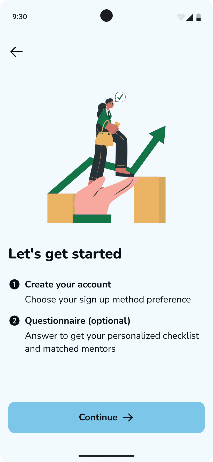
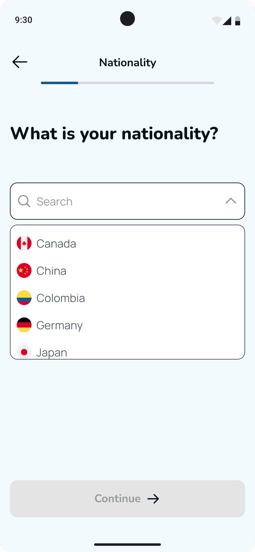
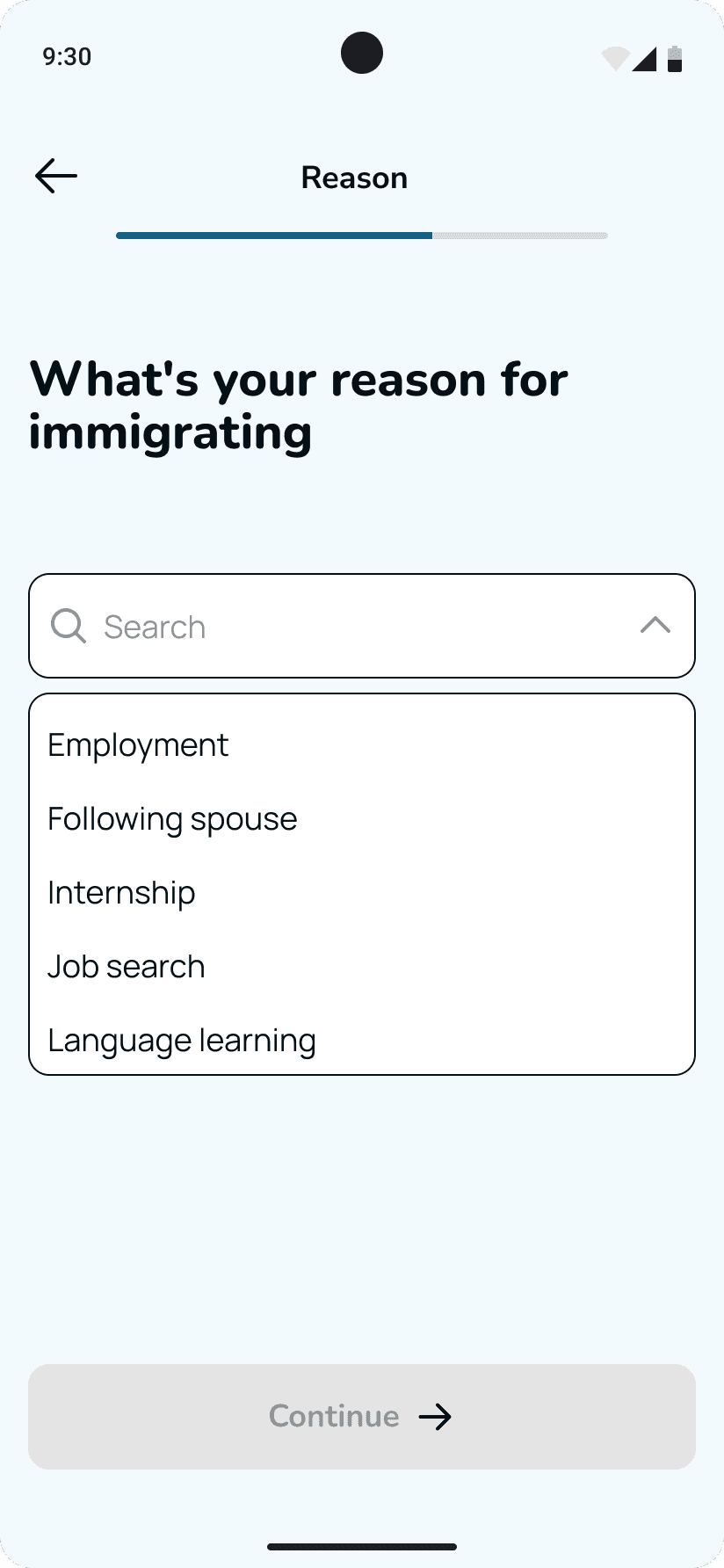
Onboarding Questionnaire
Interactive questionnaire for users to share their information, laying the foundation for their unique journey checklist
Checklist
Based on their input, users receive a personalized checklist outlining key steps for their journey to stay on track
Expert Guidance
Video calls with mentors matched to their chosen journey, who can offer personalized advice
Sitemap
This sitemap forms the basis of the website's navigation, delineating the primary user paths and content divisions. Through a strategic arrangement of the information infrastructure, my goal was to simplify the user's quest in finding their desired information, thus cultivating a favorable initial impression.
User flows
To gain a deep understanding of how users would interact with Turtlfly's core features, I developed four user flows which represent the four key user journeys: onboarding, checklist completion, mentor booking requests, and the mentor session itself. These user flows serve as a foundation for sketching the initial wireframes.
Onboarding
This userflow focuses on creating a personalized checklist based on the information the user provides. It will also find mentors who can best support their specific needs.
Checklist completion
This userflow focuses on having an already created checklist with all the important information in each item (generated by an AI).
Mentor booking request
This userflow focuses on choosing a mentor through the recommended mentor list and booking a session on the topic the user wants to discuss.
Mentor session
This userflow focuses on having the session with the mentor and rating their service, thus improving the mentor recommendations
The wireframing strategy
For this project I wanted to validate the design's effectiveness and identify areas for improvement early on. Therefore, my plan was to:
1
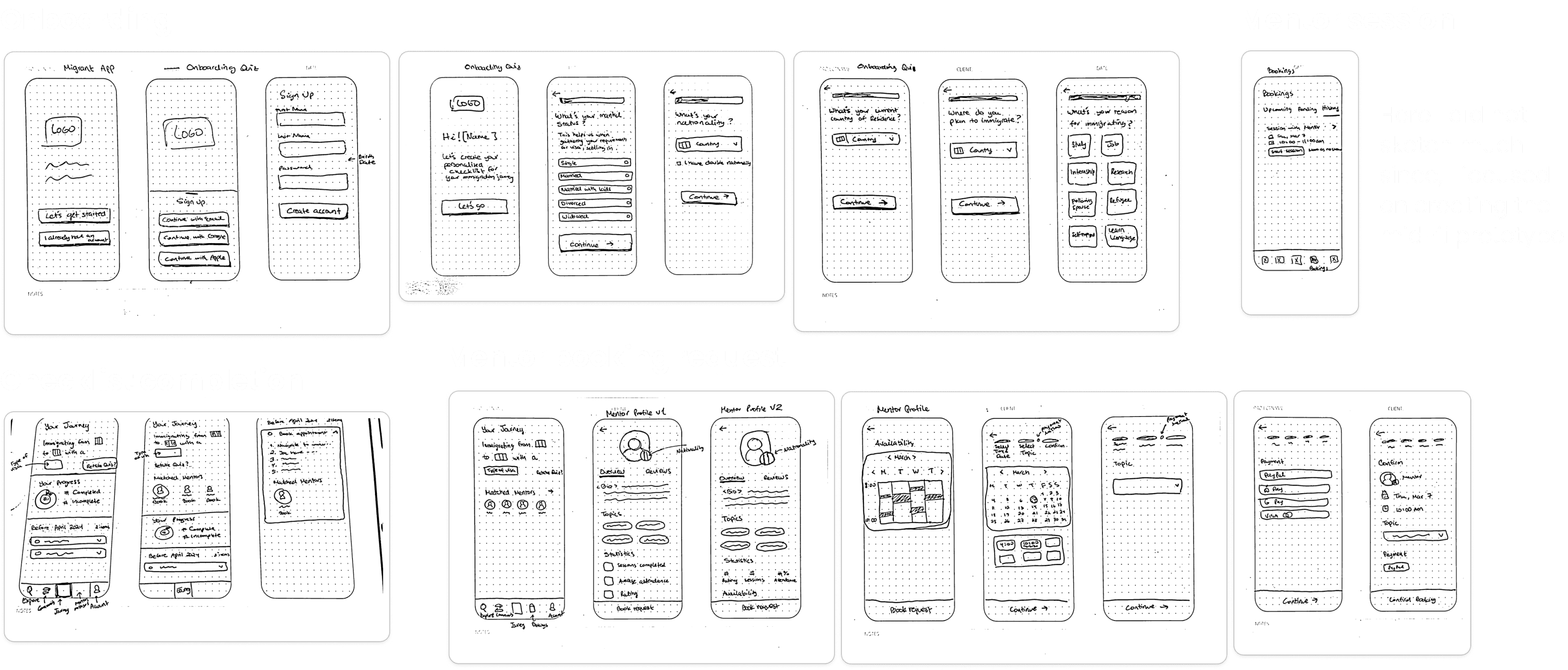
Sketches
Create low-fidelity wireframes, prioritizing functionality over aesthetics, focusing on structure and core user interactions.
2
Mid-fi Wireframes
Based on the sketches, create mid-fi wireframes which are closer to hi-fi without the branding
3
Mid-fi prototype
Use this prototype to test it with users and gather their feedback before diving into hi-fi
4
Hi-fi prototype
Once I've incorporated feedback from the mid-fi wireframe testing and developed the branding, I'll refine the mid-fi into a high-fidelity prototype.
Sketches
Mid-fi prototype
The prototype is fully functional with clear and concise UX writing. While the final branding, images, and logo are not applied, the user can can experience the core functionality of the product.
Validating the design
While the overall feedback and test results were positive, several very important points were raised that impact Turtlfly's core purpose.
Worked
“Nice to have progress right at the beginning”
“I like the amount of information you put. It's not too much or too little where I'm wondering how I'm supposed to do something, especially considering this would be like an immigration app.”
“I think if this was a thing already before I moved, I would have definitely used something like this”
“I like in general everything”
Improve
“[When marking a task as done] The way it is now I feel like I didn't do anything”
“I didn't know the checklist was down, but I would scroll anyways”
“I would like to see who has rated or if they had comments about the mentor before I booked”
Shaping Turtlfly's identity: Defining brand voice and visual language
After prioritizing user feedback, I embarked on crafting Turtlfly's brand identity. This involved defining the brand voice and visual language that would resonate with the target audience and embody Turtlfly's core values.
Brand's values
Empowerment
Prioritize giving users the knowledge and resources they need to feel in control of their immigration journey.
Clarity
Provide clear, concise, and up-to-date information to eliminate confusion and ensure users understand the process.
Welcoming
Strive to create a supportive community to all immigrants from all backgrounds where users can connect with mentors, share experiences, and feel part of a larger community
UI component library

User's feedback builds effective hi-fi wireframes
Now after having the branding it is time to introduce it in the design as well as making the changes based on the user feedback received.
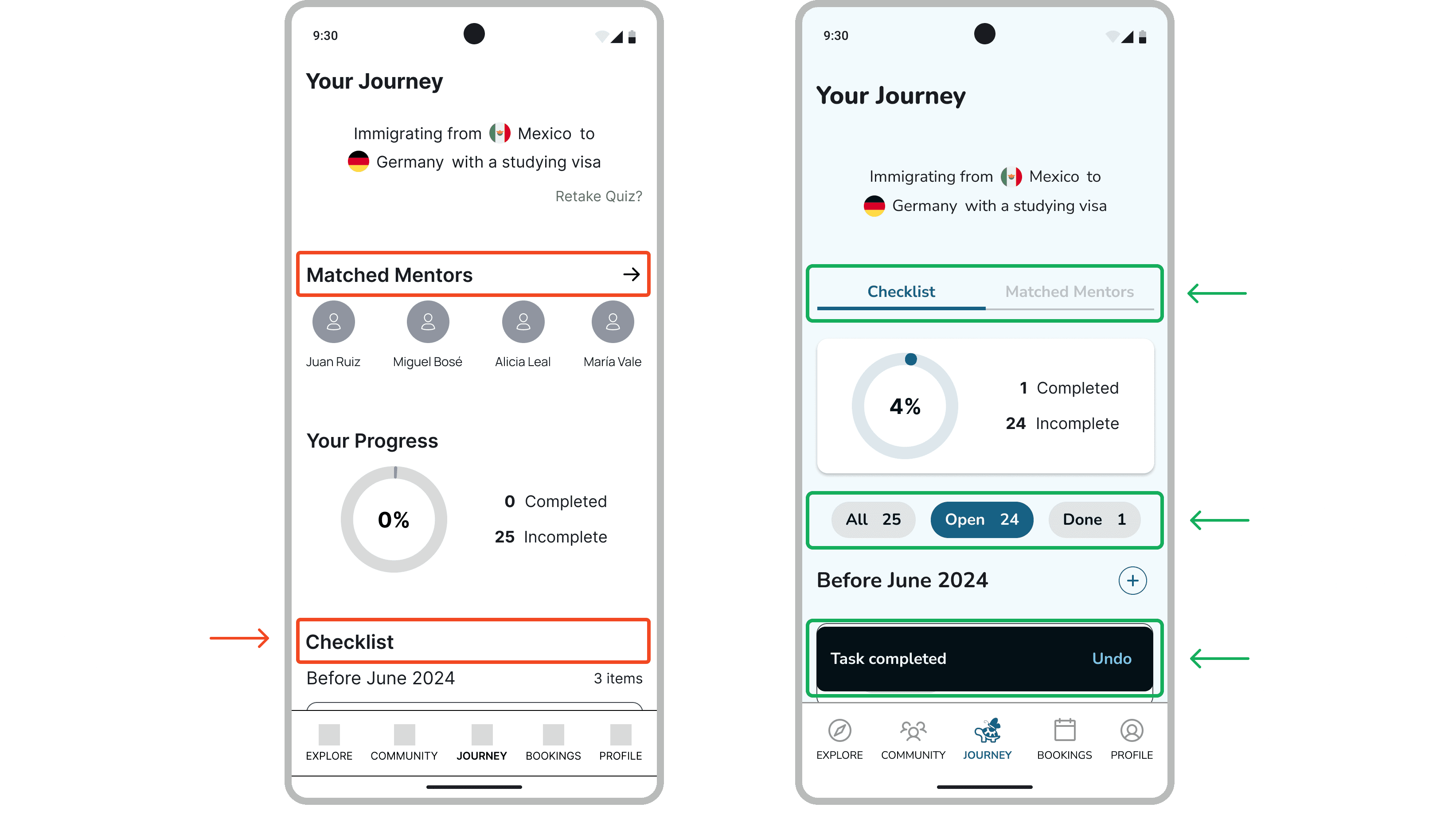
Addressing user challenges
Improved checklist visibility and feedback.
Solving user uncertainty
Introducing personal metrics, search tools, and detailed mentor profiles.
Addressing user confusion
Enhanced mentor statistics, readability, and selection clarity.
Turtlfly prototype
Here is the hi-fi prototype after integrating the branding and user feedback.
What did I learn?
Maintaining focus is key
Working on a project I’m passionate about was both exciting and challenging. I initially wanted to expand the app's features quickly, but with my mentor’s guidance, I refocused on the core objectives. It taught me the value of maintaining a clear vision while staying flexible. This experience sharpened my ability to focus on the essentials without losing sight of the bigger picture.
Balance user and business
Initially, I envisioned a model where mentors offered free advice based on shared experiences, which aligned with the app's mission. However, during usability testing, users expressed interest in paying for mentorship services. This insight highlighted the importance of balancing user needs with business goals. While I stayed true to the original vision, I recognized the potential to explore a paid mentorship model through additional research. This approach ensures that the app remains user-centered while also considering future scalability and investor interest.
Iterating for maximum impact
Time constraints limited my initial designs, but gathering diverse feedback improved the final product. I saw how crucial iteration is in refining designs and uncovering new ideas. Iterating based on feedback ensures a more impactful and user-centered outcome.
Next steps
Refine the design through usability testing
Conduct usability tests with high-fidelity wireframes to identify any user experience issues and ensure the design is intuitive and efficient.
Validate monetization strategy
Conduct further user research to definitively determine user sentiment towards a paid mentorship model within the app. This will help solidify the app's business model.
Develop userflows for remaining functionalities
Create detailed user flows for the "Explore" and "Community" features, outlining the steps users will take to interact with these functionalities effectively.
Other work
Webtoon

Mobile app
UX/UI Design
Q4 2023
Florana

Responsive Website
UX/UI Design
Q3 2023
Let's connect!
Come say hi! And let's create something awesome together
2025 Claudia De León


