Webtoon
An app that hosts a wide variety of webcomics and webtoons, essentially online comics. It not only offers webtoon readers webtoons to read, but also helps webtoon readers to effortlessly manage their series and stay informed on their series status.
Android mobile app
Role
Product & UX/UI Designer
Duration
Q4 2023


The challenge
Avid webtoon readers are frustrated and confused by disorganization and lack of visibility
Webtoon readers find the current organization of their subscribed list unorganized and sometimes confusing. They struggle to keep track of their progress within a series, which affects their engagement and motivation. Locating specific series within a long, frequently updated list is challenging and frustrating. Additionally, readers find it difficult to stay informed about the return of a series or when it goes on hiatus, leading to a disjointed reading experience.
The solution
Seamless series organization and up-to-date reading
I explored and designed a new method for webtoon readers to effortlessly manage their series and stay informed on their reading. This reduces the feeling of frustration and increases their motivation in reading their susbcribed series. Thus, transforming their reading experience.
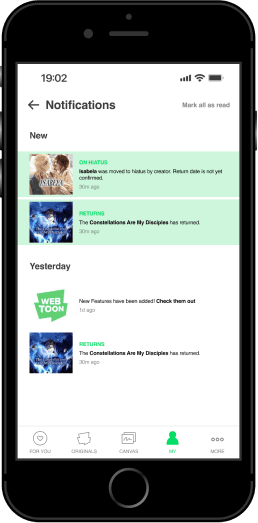
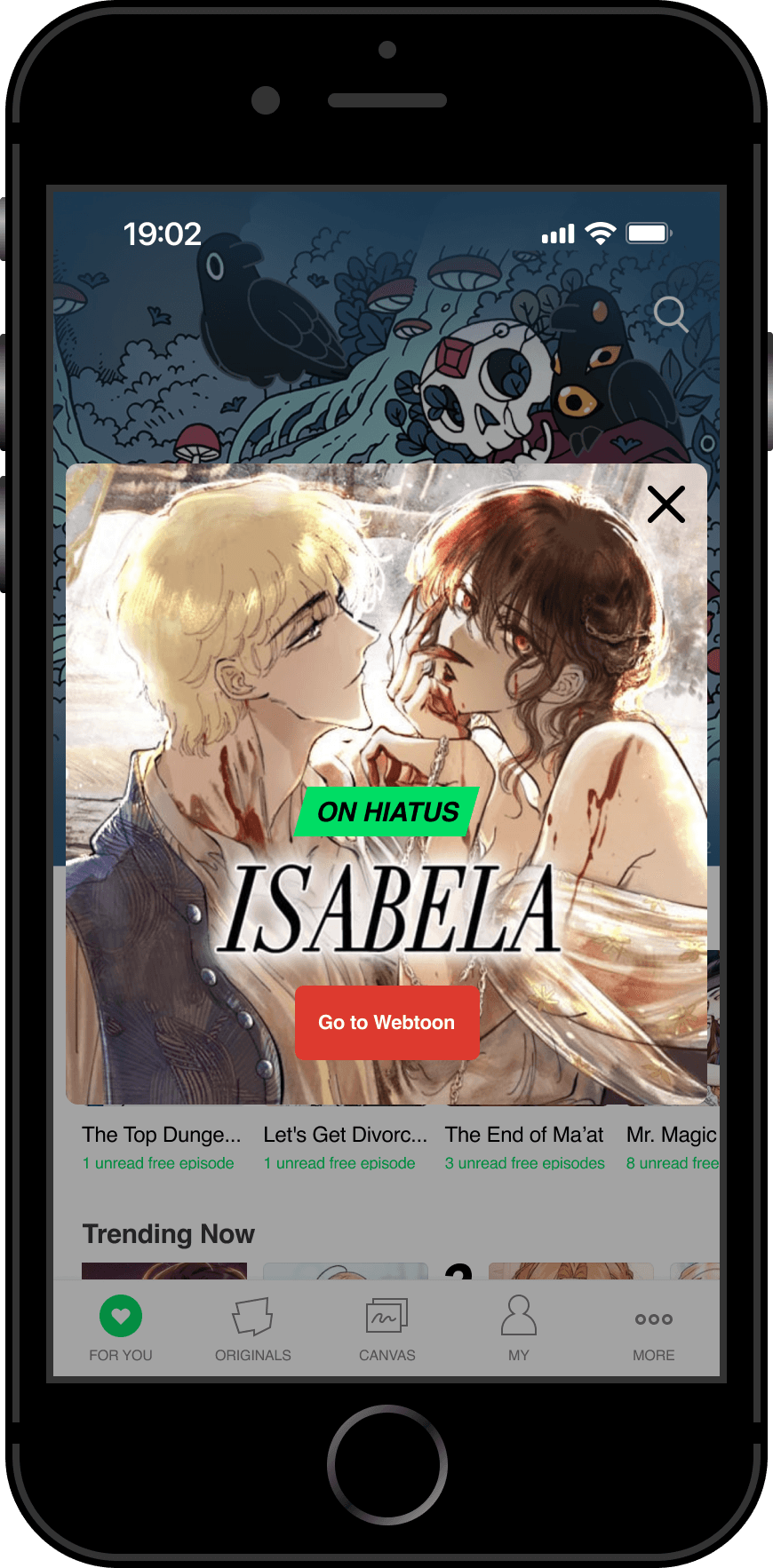
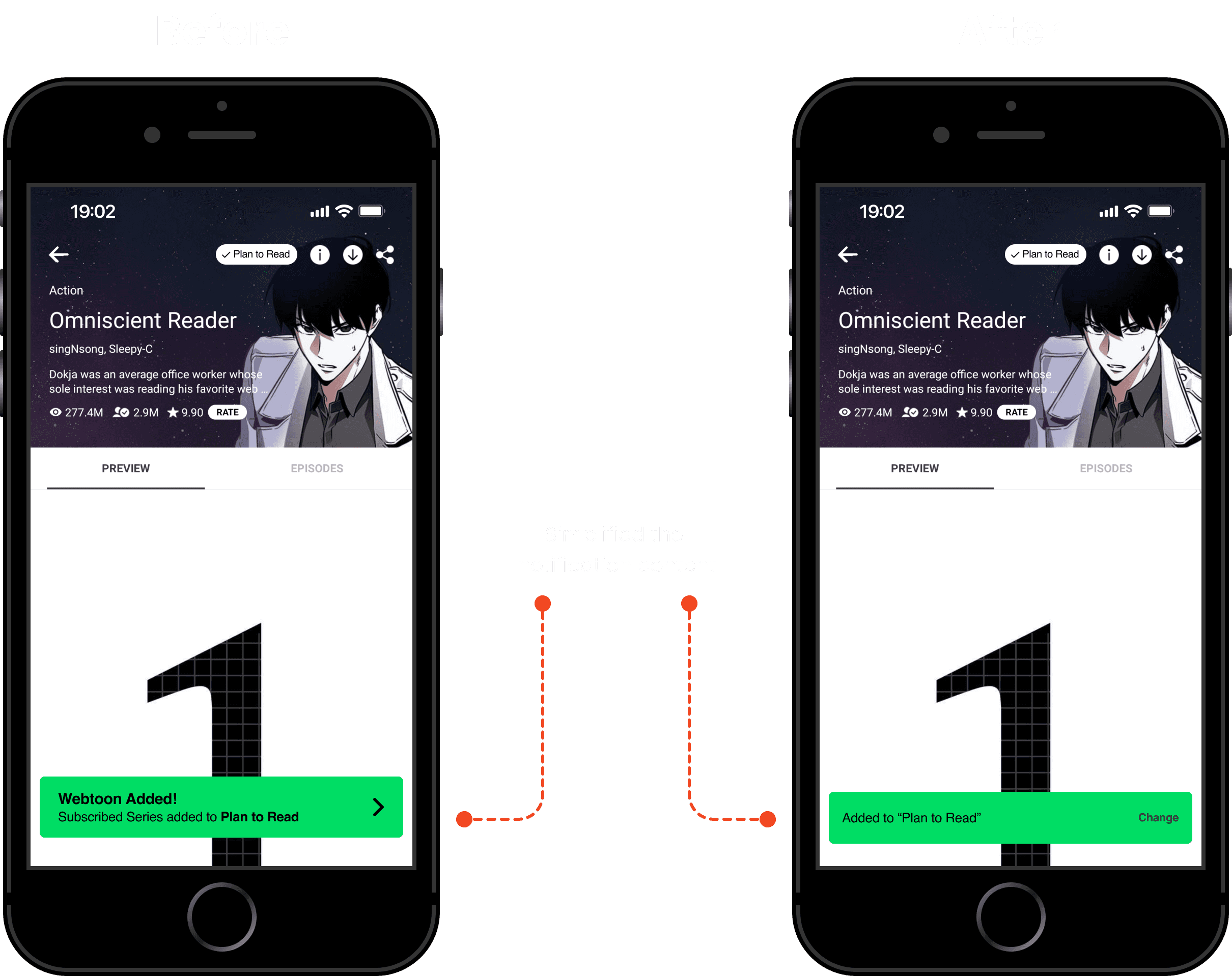
Webtoon notifications
Stay up-to-date with the latest updates on your favorite webtoons. The convenient notification bell on the homescreen ensures you never miss an important announcement. View all notifications from your webtoon status (on hiatus/returns) and app changes in one central location.
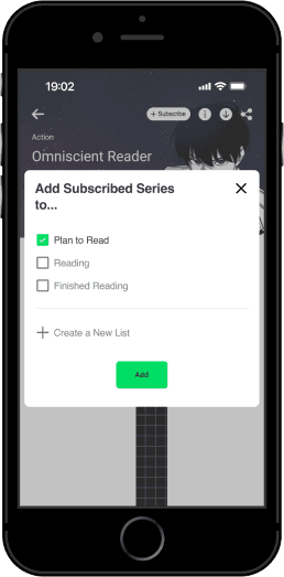
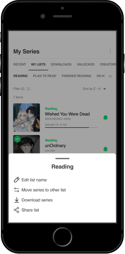
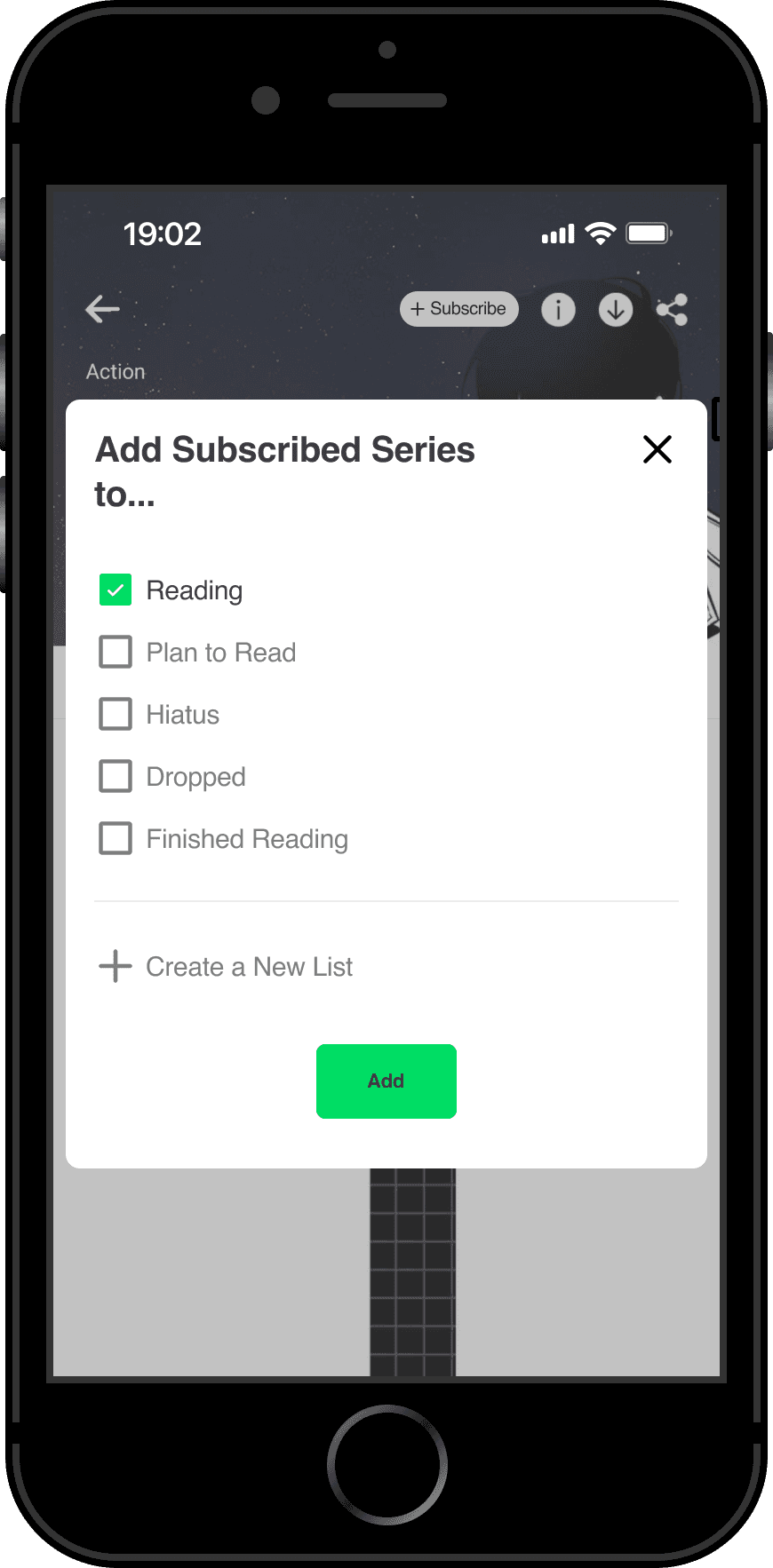
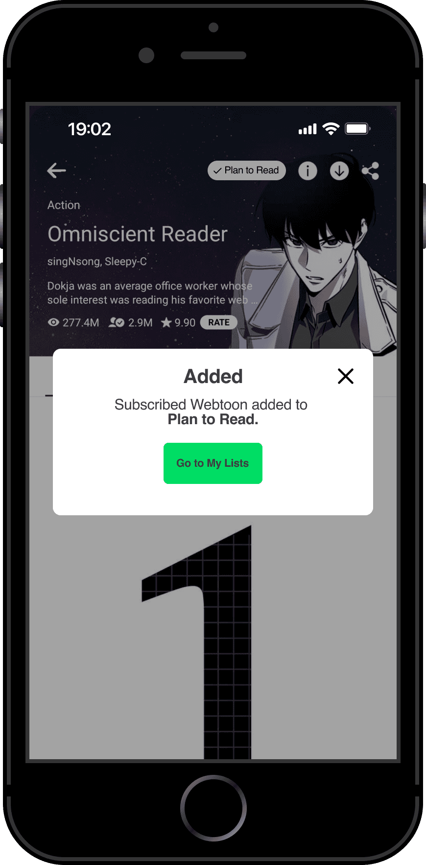
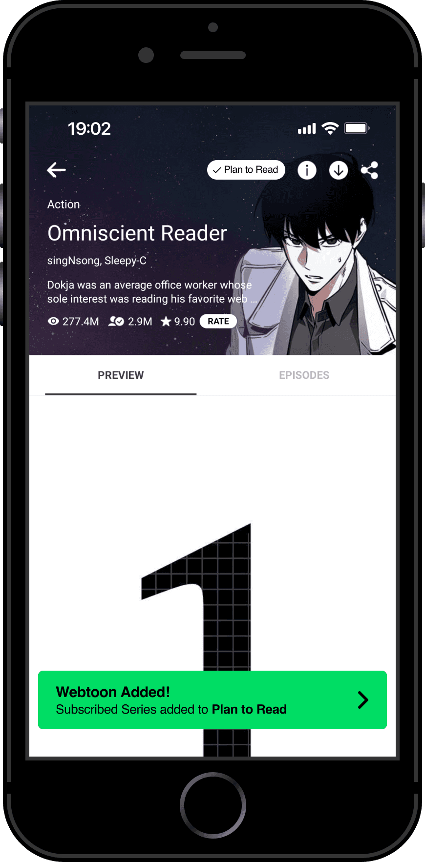
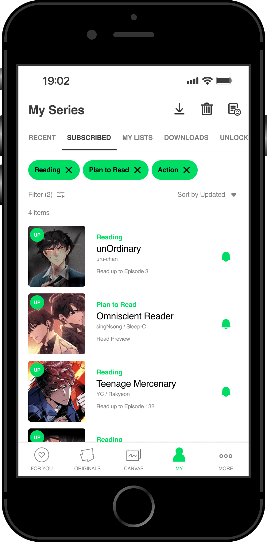
Webtoon lists
Tailor your webtoon experience by adding subscribed series to existing lists or creating new ones. Track your progress on each series within your lists, keeping your reading journey organized and enjoyable.
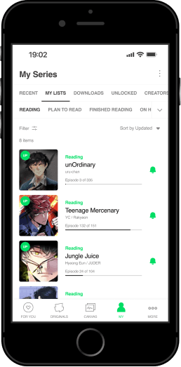
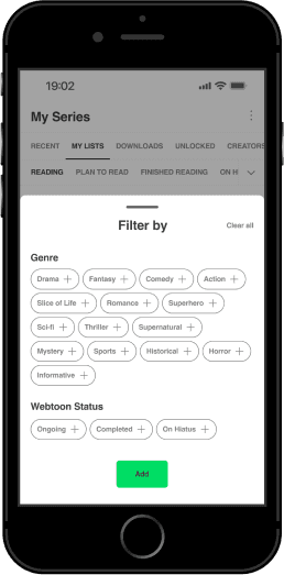
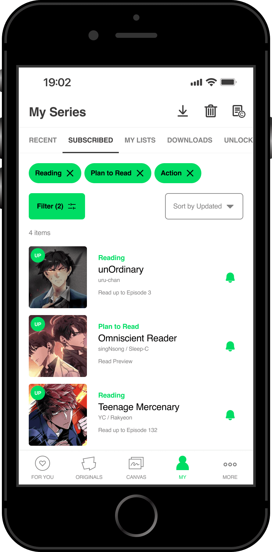
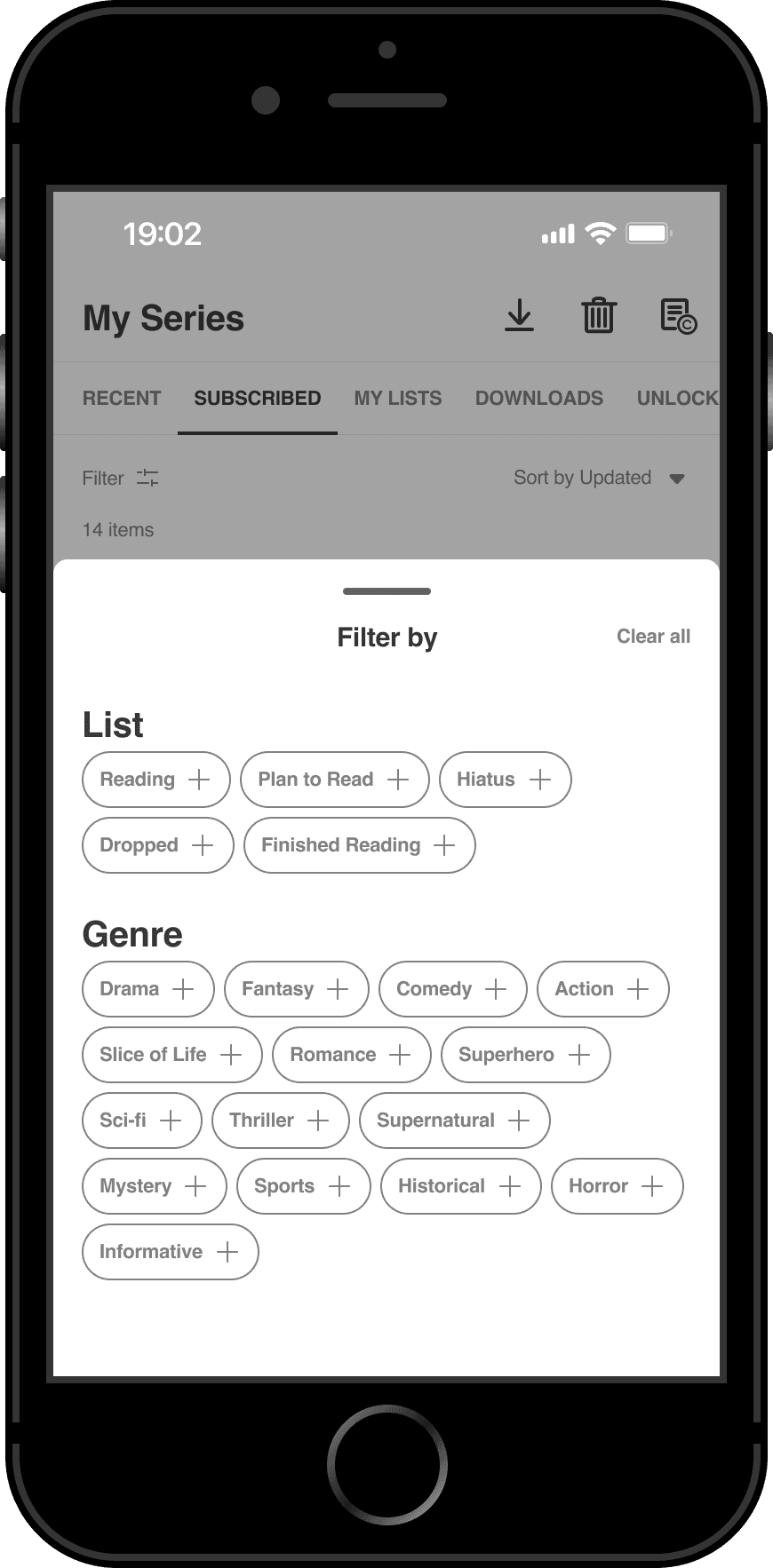
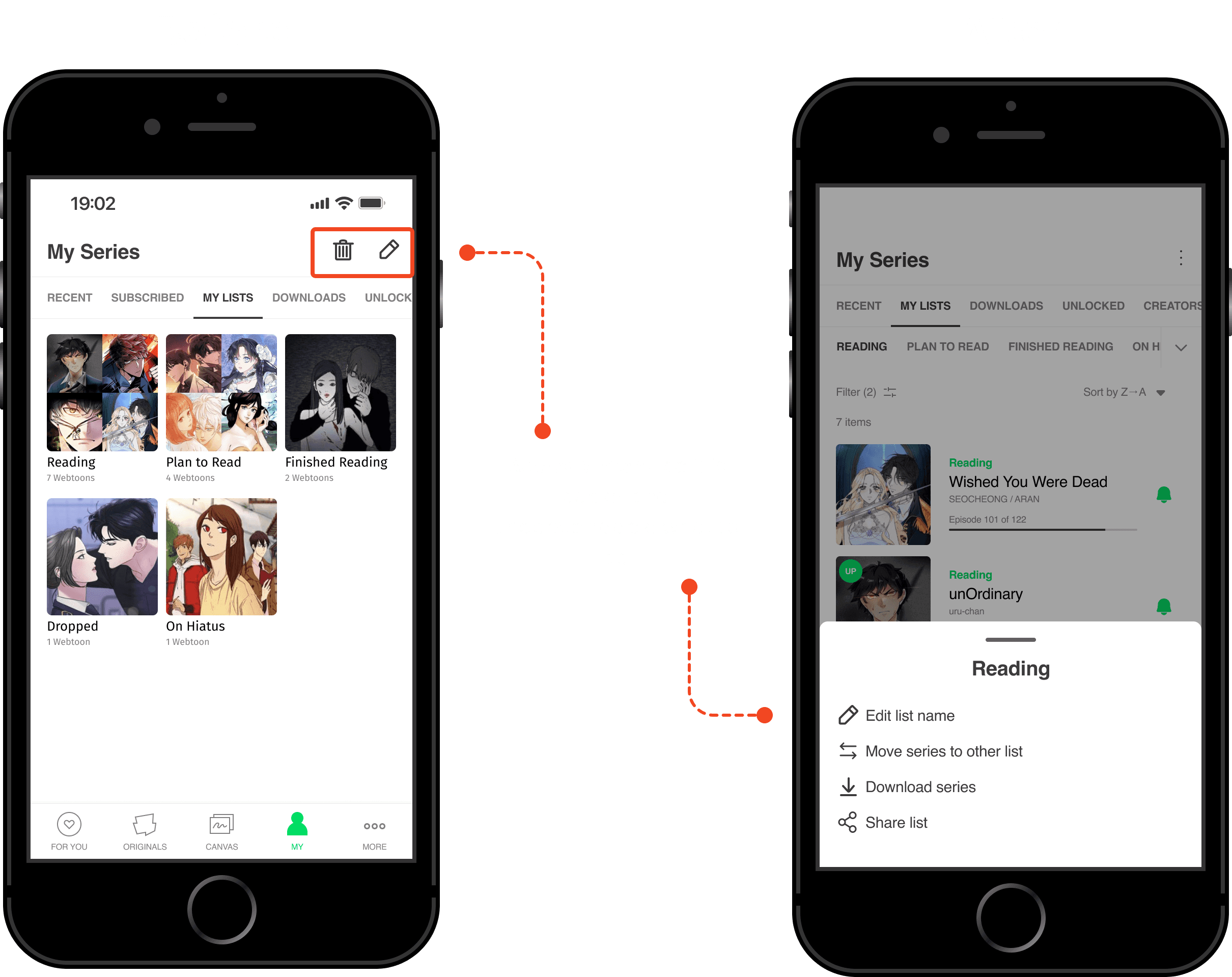
Webtoon list management
Easily organize and categorize your webtoon library. Filter your lists by genre or status, and manage your subscribed series with ease. Access and sort all your lists in one convenient location..
*Not all screens are shown
Let's get into the design process
What do users have to say?
To truly understand the problem, I conducted online and in-depth user interviews with 6 Webtoon participants. They shared their joys, their struggles, and everything in-between when it comes to managing their ever-growing collection of Webtoons.
"That's just one huge list. So I wish there was a way to, maybe create my own list. So I can organize it better."
"I have so many (subscribed series) I could like easily pass it and not see it at first glance because everything it's just like together in one long list and there isn't really any way for me to like search or filter it out somehow."
"But if I have to stop it then I have to figure out like which episodes I'd have to start like there is no tracker"
What are Webtoon and its competitors doing?
I realized a competitive analysis of Webtoon's key competitors. This analysis helps in understanding their strengths and weaknesses, enabling the identification of what Webtoon can offer to its users.


Key findings
All competitors just use one subscribed list
Limited sorting and filtering options for the subscribed series (if at all)
Difficult to track at first glance which episode the user is on
Opportunity identified
Stand out from competitors’ limitations by providing flexibility in subscribed lists, granular sorting/filtering, and intuitive progress tracking.
Connecting the dots: Unveiling user insights
After gathering the webtoon readers' thoughts, I started to group similar thoughts together to identify the most common themes and key user insights.

Common themes
Manage subscribed series
Find subscribed series to read
Discovering webtoons
UI and Usability
Webtoon preferences
Earn coins
Reading experience
Preferred device
Key user insights
83%
of users find their subscribed list disorganized and confusing
67%
of users struggle to locate specific series in a constantly changing list
67%
of users want to be able to order their subscribed series according to their preferences
50%
of users appreciate updates on series returns and hiatuses
of users value visual progress tracking within series to stay engaged and motivated
Who I design for
Based on the user interviews and affinity mapping, I created 2 user personas which represent the target audience.
Problem statement
Webtoon users struggle to manage their subscriptions due to a disorganized list. This makes it hard to find specific series and track progress. To improve engagement, a new feature is needed to organize subscriptions, track progress, and notify users about series updates.
Turning user needs into HMWs
Based on the knowledge of who I am designing for and the key insights derived from the research, I defined various How Might We (HMW) questions which will serve as a foundation for brainstorming different solutions that directly address the needs and pain points of webtoon readers.
How might we…
enable webtoon readers to efficiently organize and manage their subscribed series to reduce frustration and save time?
of users struggle to locate specific series in a constantly changing list
of users want to be able to order their subscribed series according to their preferences
We understand who our target audience is (from user personas), the challenges they face (from the problem statement), and how to explore solutions (through How Might We questions). It is time to move from insights into action
Feature prioritization
After understanding the users I am designing for and formulating the HMW questions. I used these queries as the basis for generating feature ideas. Then, I applied the MoSCoW matrix to prioritize these features. The features in the Must-Have quadrant will be the ones to focus on.

Mapping the user journey
Based on the identified key features, I created a user flow that maps out the user's journey through the product with the new incorporated features. This visual representation provides valuable insights for designing the product.
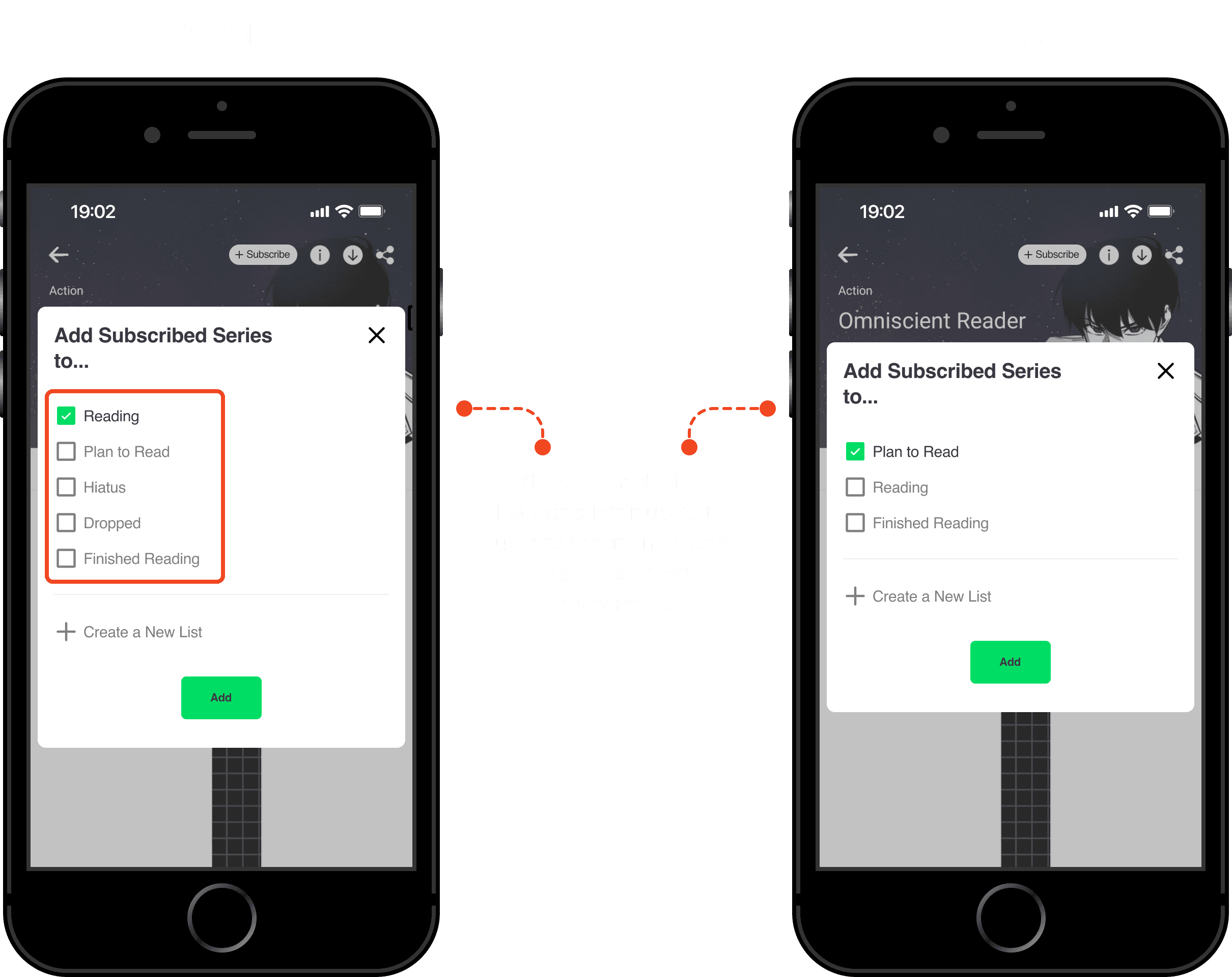
Adding a series to a list
This user flow focuses on empowering users to add subscribed series to either a default list provided by the app or a custom list created by themselves. By offering this flexibility, I aim to provide users with greater control and freedom in organizing their webtoon collections according to their preferences.

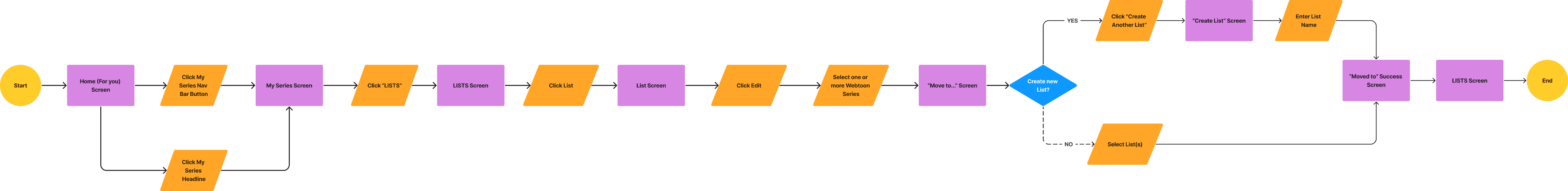
Change a subscribed series to another list
This user flow enables users to seamlessly transfer their subscribed series from one list to another. This feature provides flexibility and allows users to reorganize their webtoon collections based on their evolving preferences, ensuring a personalized and efficient reading experience.
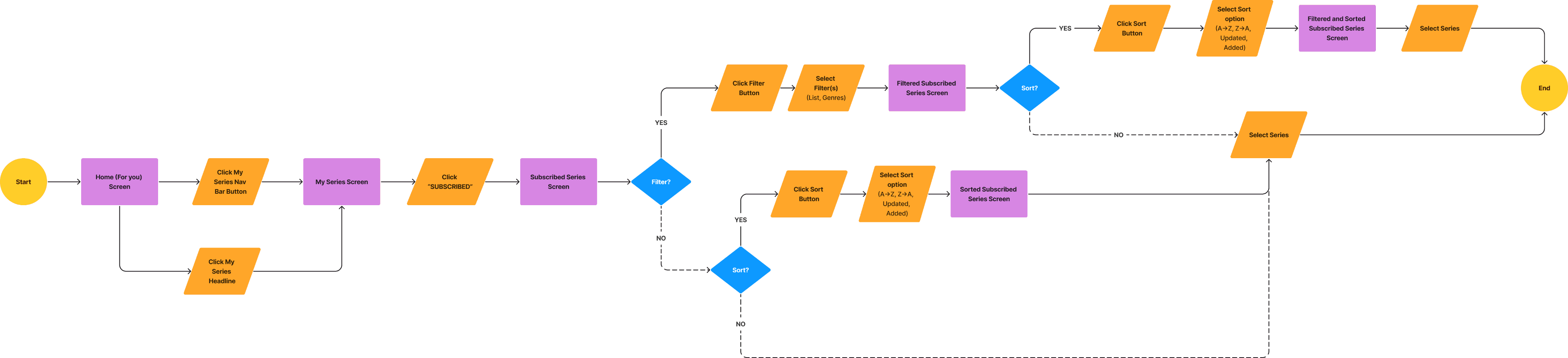
Filter and sort subscribed series
This user flow empowers users to efficiently navigate their webtoon lists through customizable filtering and sorting options. By enabling users to tailor their browsing experience, I aim to facilitate quick and easy discovery of their desired series.
Designing the features
Since the feature is something that is for an existing product, I started by creating low-fidelity wireframes to brainstorm and iterate on different feature options. This way I could determine which features held the most potential for high-fidelity development.
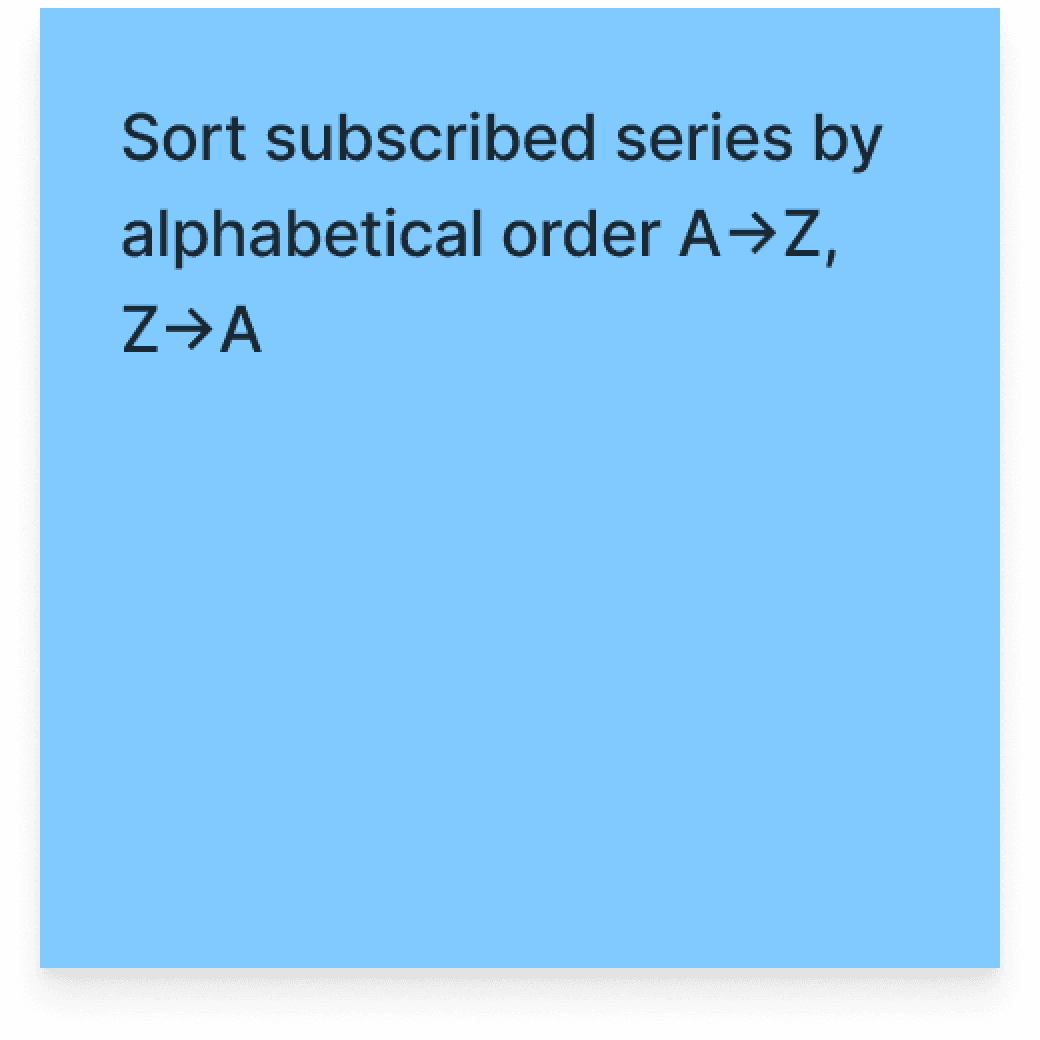
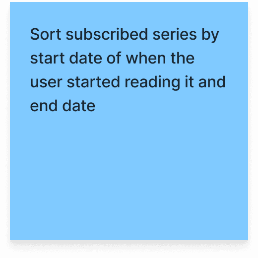
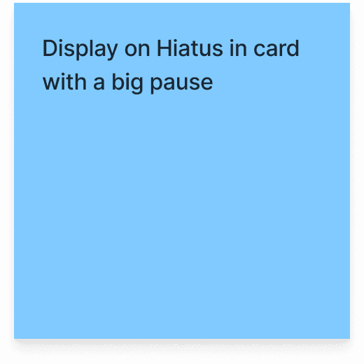
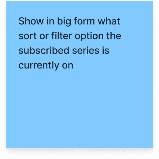
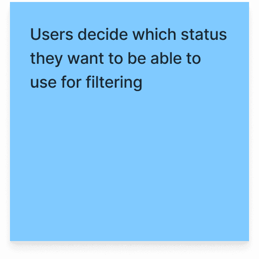
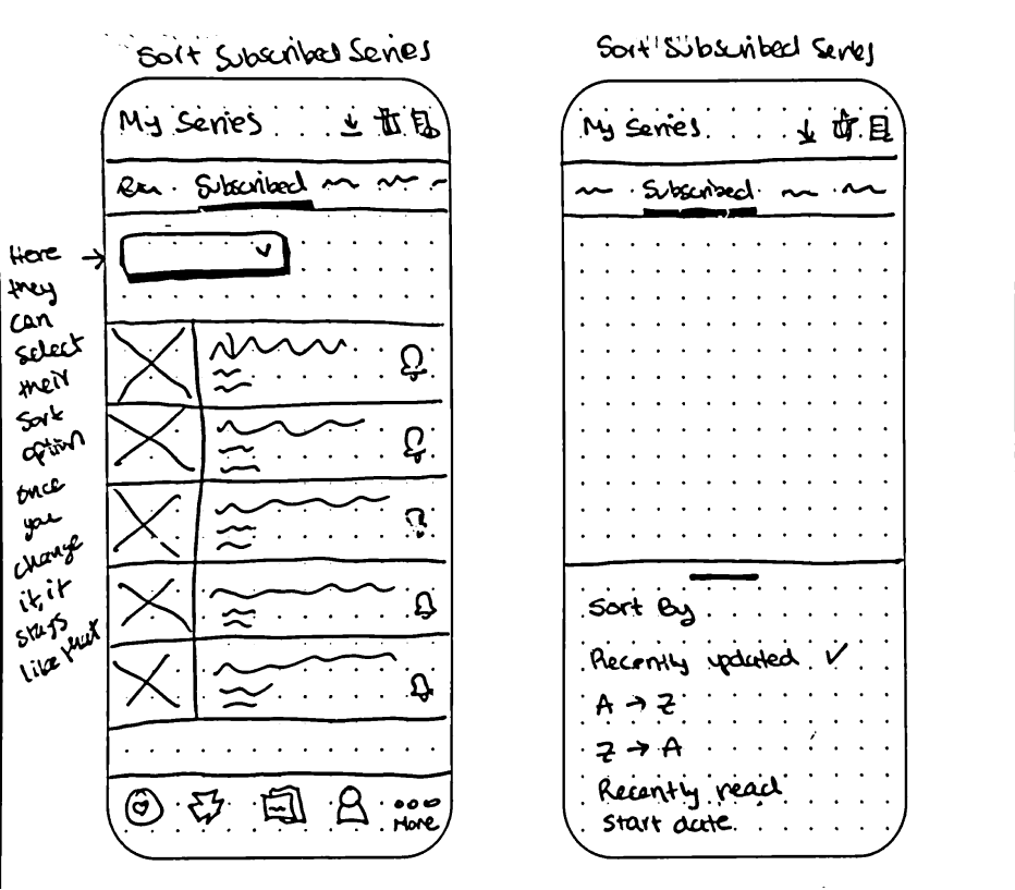
Sort subscribed series
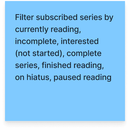
Filter series

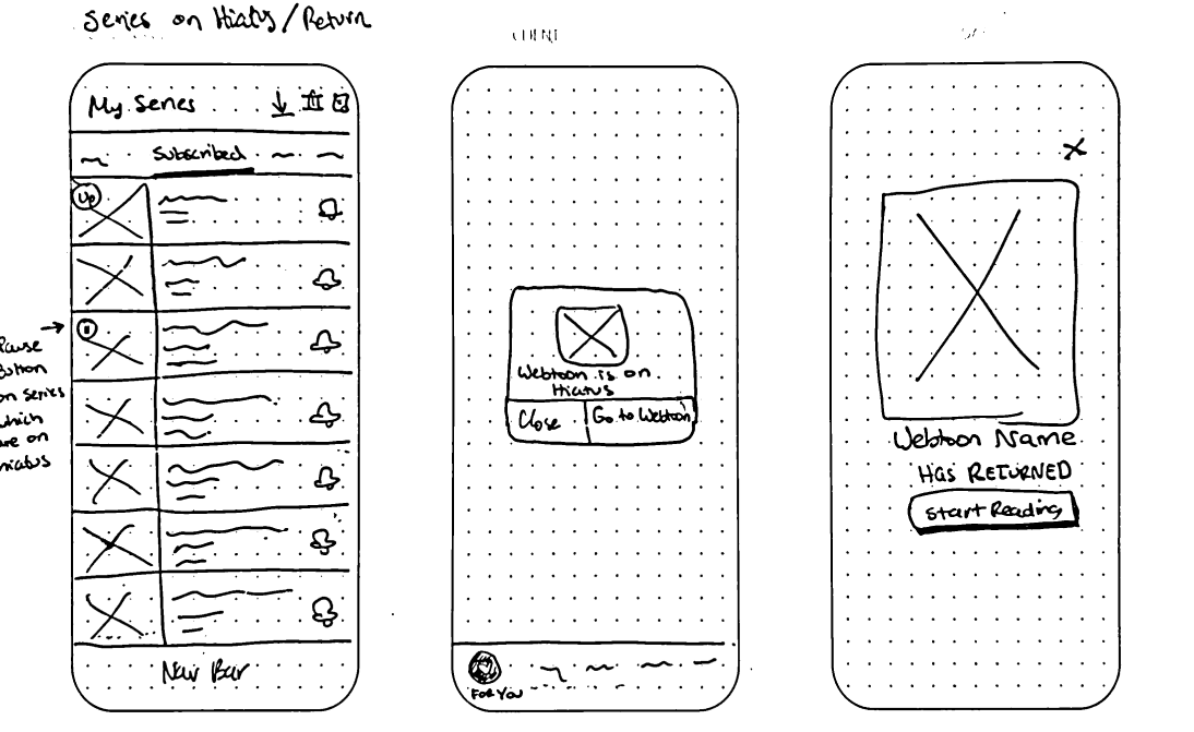
Notifications of series on hiatus/return
Personal dashboard and one screen of episode progress

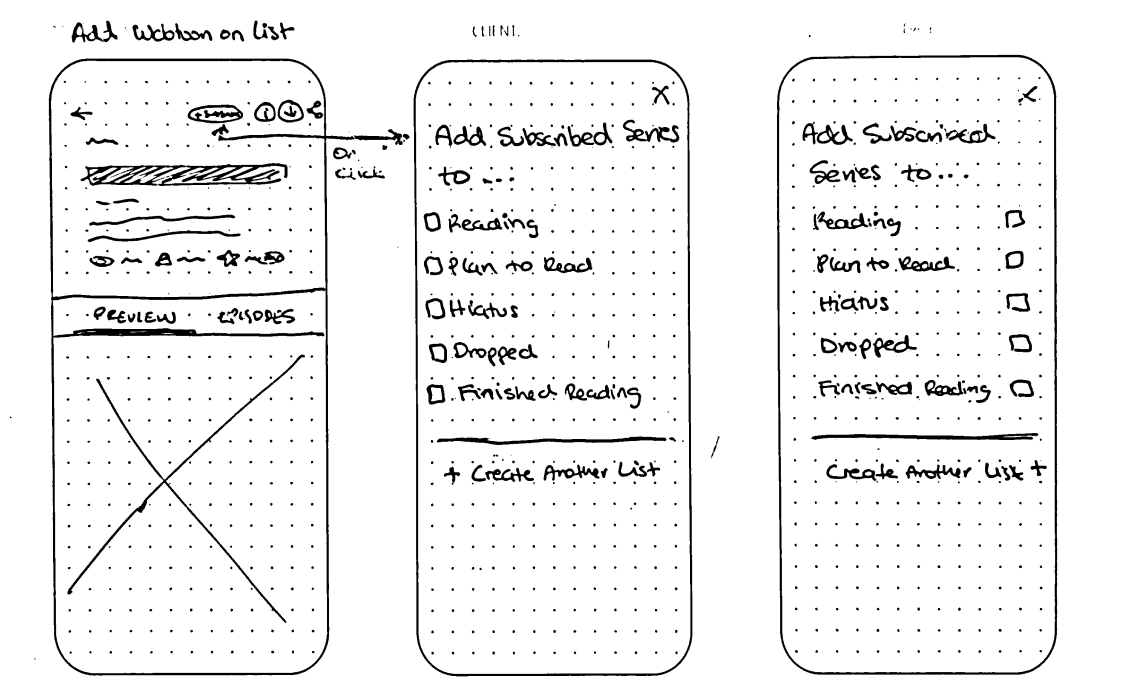
Add Webtoon to list
Visual episode progress

Insights from low-fi wireframes
During the low-fi wireframing stage, I realized the absence of both the personal dashboard in the user flow and notifications for hiatus/return.
Due to time constraints, my mentor and I had a discussion and decided to omit the personal dashboard, while it offered potential value, user research suggested it wasn't a critical element for their immediate needs. However, we acknowledged the significance of notifications, given their minimal time investment, and chose to include them.
This decision allowed me to focus development efforts on high-impact features while ensuring core functionalities were maintained.

Finalizing the features’ design
In designing the screens, I primarily adhered to the established Webtoon Design System, ensuring consistency and familiarity for users. When necessary, I used the parent company NAVER Webtoon as a source of inspiration for specific features. As Webtoon's parent company, utilizing NAVER's design elements strategically allowed me to maintain brand coherence while exploring potential enhancements for certain features.
Testing the prototype
The usability test of WEBTOON was moderated and performed remotely with 6 participants. Each session was with the figma prototype and it lasted around 30-45 min. The participants were asked to complete tasks from the user journey.

Although the metrics were outstanding,
the task “Likelihood of using the feature” for Flow 3 wasn't as strong.
there were various comments on the flows in general which affects the usability
The main issues were:
List management challenges
Users encountered difficulties managing their subscriptions, including moving webtoons between lists, changing default lists, confusion about deleting entries, and some forgetting to unsubscribe.
Flow and interface
Improvements were identified in user flows for adding webtoons to lists, filtering/sorting functionalities, and changing the list of a subscribed webtoon.
Visual Clarity and User Experience
Enhancements were needed to improve clarity and user experience: a less intrusive hiatus/return notification, a progress bar for ongoing webtoons, clearer distinction between "Subscribed" and "My Lists" tabs, more descriptive default list names, and a visually engaging "Add to List" overlay
Feedback improves functionality
After having the user feedback it is time to make the adequate changes to the design.
Return/Hiatus notifications were too much!

List names are not clear! Especially hiatus and dropped
Notification design B is good! But too much text!
It is too many steps to just filter my selected list!
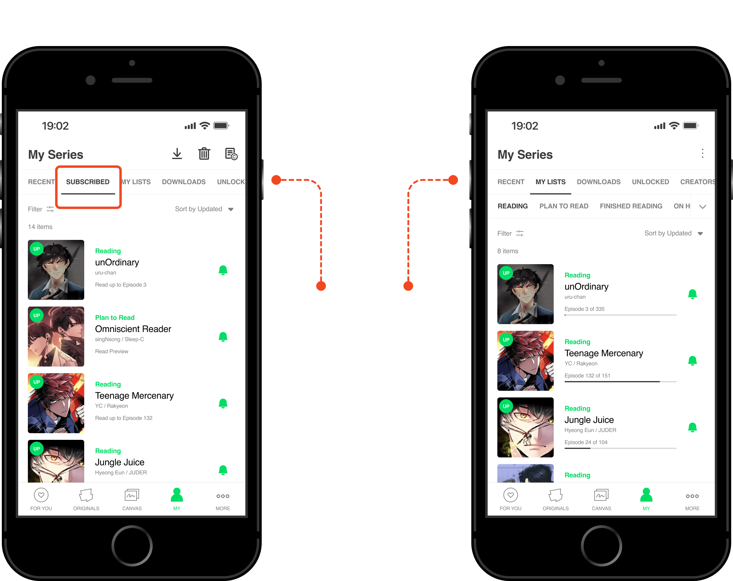
I will never filter “reading” and “plan to read” together

Where do I click? What does the trashcan and pencil do? Confusing to move series to another list
The prototype
Here is the hi-fi prototype after integrating the user feedback
What did I learn?
Collaboration and iteration are key
This project reinforced the importance of collaboration and iteration in design. Things change, but I need to make sure to define the problem as most that I can. A well-defined problem statement serves as a strong foundation.
Deepen user research
I need to carry out a better and more in depth research. This will allow for a more comprehensive understanding of user needs and lead to more effective design solutions.
Refine Survey Design
I need to improve my surveys. For this project I used a preliminary survey to evaluate if the project made sense to do. Effective surveys are a valuable tool. I'll work to improve my survey design for clearer and more actionable feedback.
List sharing
Some user comments suggests a potential value in list sharing. I think it would be good to see if the lists can be shared. This way friends can recommend a list of webtoons to each other easily, instead of clicking each webtoon.
Next steps
Optimize Wireframe Screen Size
Improve the wireframes screen size since as of now it is too small since it is iPhone 8 screen.
Enable List Sharing and Recommendations
I think it would be good to see if the lists can be shared. This way friends can recommend a list of webtoons to each other easily. Instead of clicking each webtoon.
Incorporate a List Search Bar
Evaluate and/or implement a search bar on the lists for people to quickly search for the webtoon they want. This will allow users to quickly and efficiently find specific series within their collections, saving time and effort.
Other work
Turtlfly

Mobile app
UX/UI Design
Q1 2024
Florana

Responsive Website
UX/UI Design
Q3 2023
Let's connect!
Come say hi! And let's create something awesome together
2025 Claudia De León